
Overview
San Diego Hunger Coalition (SDHC) collaborates with community partners to create equitable access to food assistance across San Diego County. Their work focuses on research, education, and advocacy, strengthening the food assistance network while empowering both organizations and individuals.
For this project, our team focused on clarifying SDHC’s role as an informational and educational resource (rather than a food bank) and improving how resources are presented for individuals and organizations.
The redesigned website helps reduce misconceptions, provides clear guidance on food assistance resources, and elevates SDHC’s mission of ensuring equitable access to food.
Role
UX/UI Designer
Members
Annabelle Zhou, Wendy Moy, Nela Schechtman
Duration
6 months
Tools used
Design Process
Discover
Heuristic Evaluation
SWOT Analysis
Meeting w/ Stakeholder
Define
Affinity Map
User Research
Ideate
Create Roadmap
User Flow
Design
Lo-Fi Designs
Mid-Fi Designs
Prototype
UCD Process
Research and Analysis
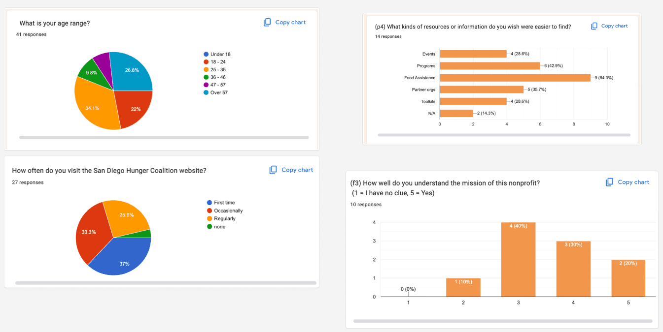
Through user research, surveys, and a SWOT analysis, we identified two main challenges with the San Diego Hunger Coalition’s website. The mission statement lacked clarity, leading many users to mistake the Coalition for a food bank rather than an informational and advocacy resource for programs such as CalFresh, WIC, and SUN Bucks. In addition, resources for partner organizations (e.g., Hunger Free Navigator trainings) were presented alongside individual-facing materials, creating navigation issues.
Our survey of 42 participants—including service providers, volunteers, staff, community members, and students—reinforced these findings. While users valued the information, cluttered design and confusing navigation often caused them to miss key details. Overall, the research underscored the need for clearer messaging, stronger structure, and a more intuitive user experience.

User Research
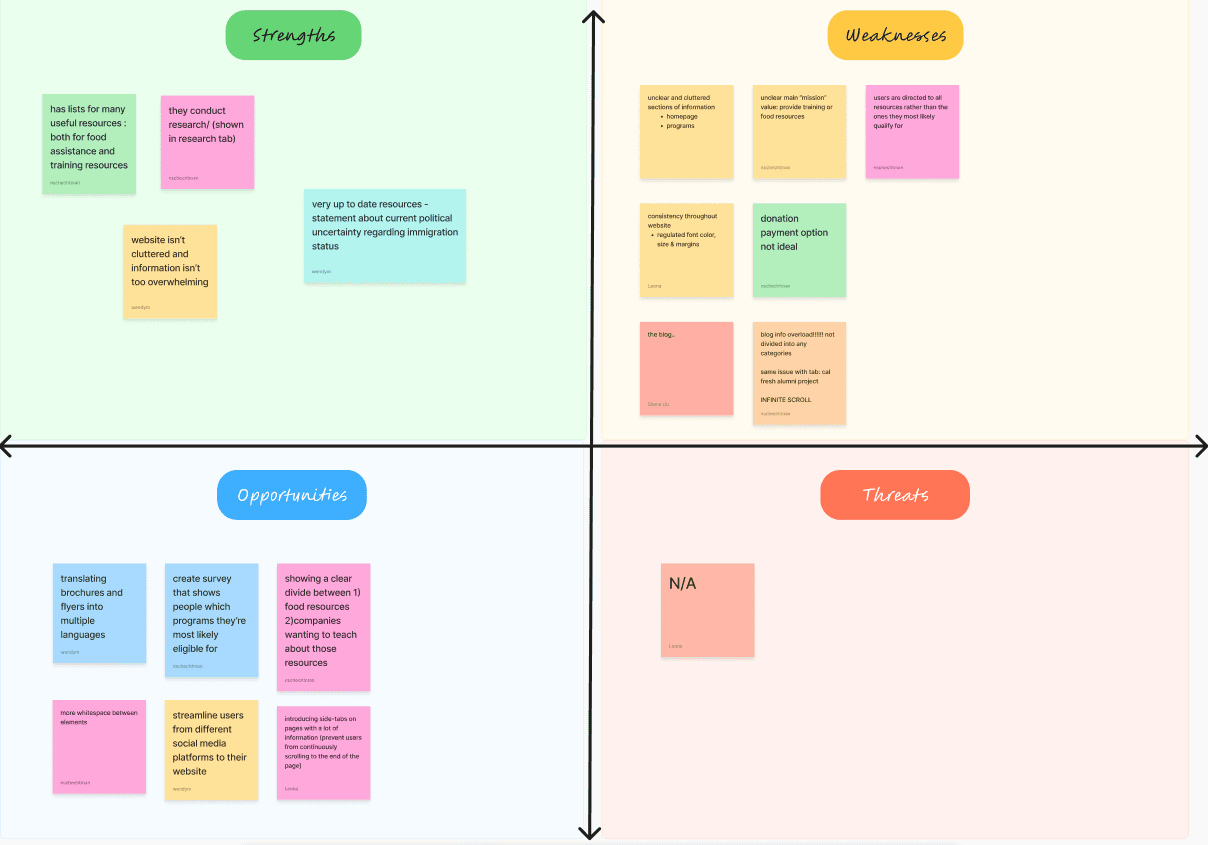
SWOT analysis
UCD Process
Ideation and Concept Development
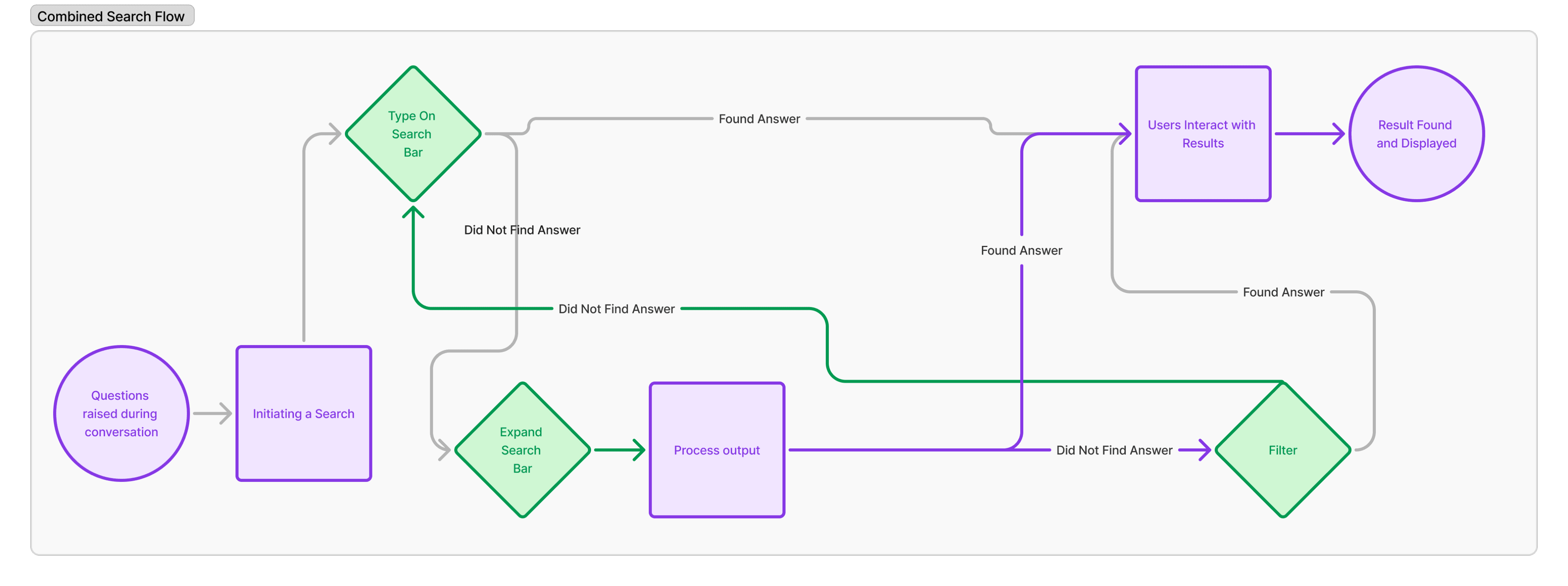
Our team held brainstorming sessions to address navigation and organization issues, developing early UI sketches to guide restructuring. After discussions with our stakeholder, we finalized a new website structure with several key changes:
Clearer Organization: Content was reorganized into more intuitive sections and renamed for clarity.
Navigation Bar Updates:
Removed the “Subscribe” button.
Added two new sections:
Food Assistance Programs – consolidates resources for individuals (e.g., CalFresh, WIC, SUN Bucks).
Education and Outreach – tailored for organizations and providers, featuring training programs and support tools.
Research Section: Miscellaneous information, such as government policies and hunger facts, was moved here for better accessibility.
These changes separate individual-focused and partner-focused resources, reducing confusion while keeping most existing pages intact.

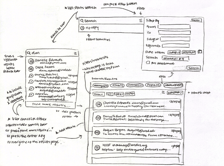
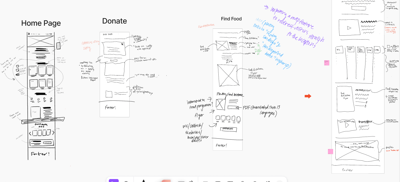
User Interface Sketches
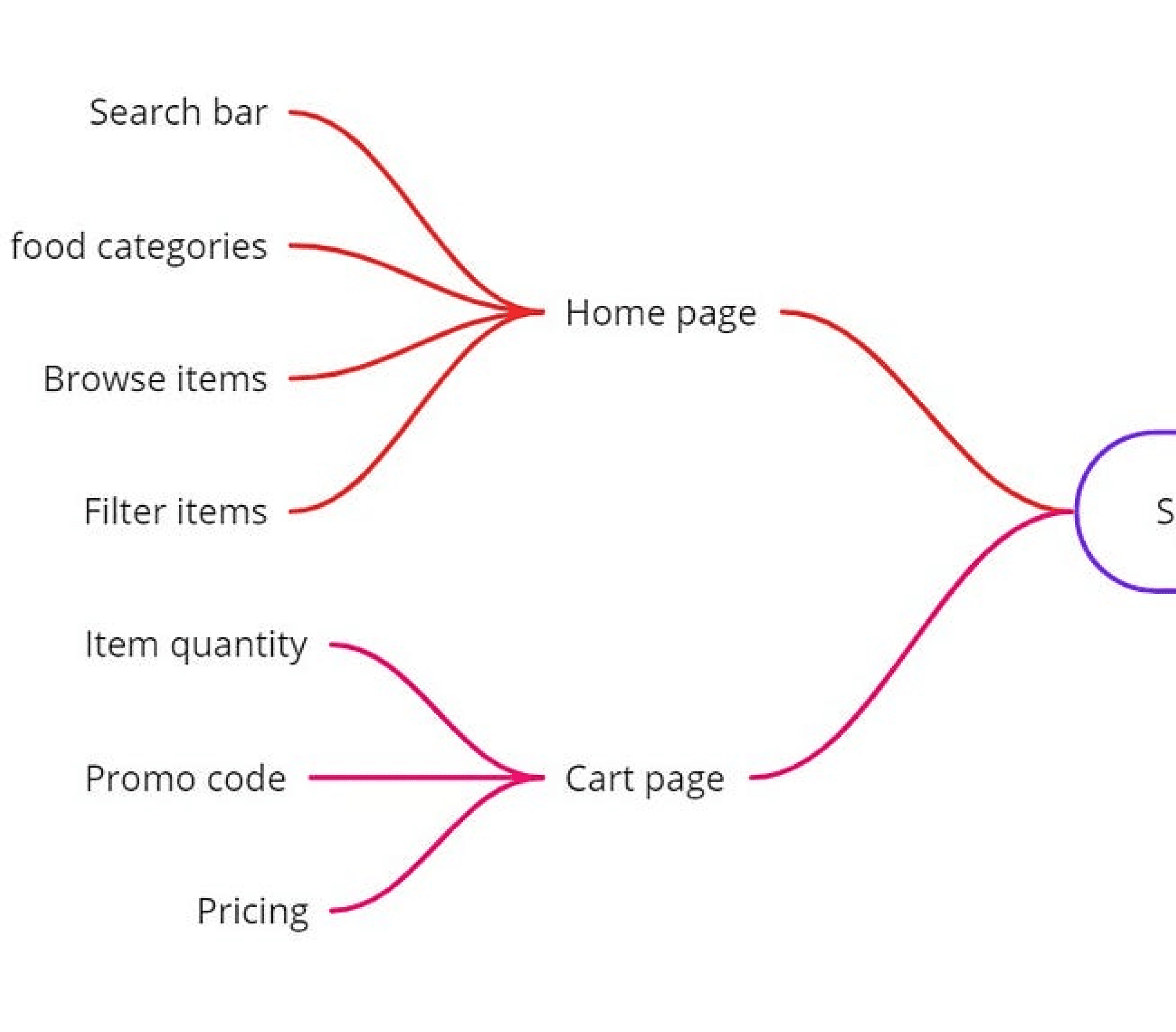
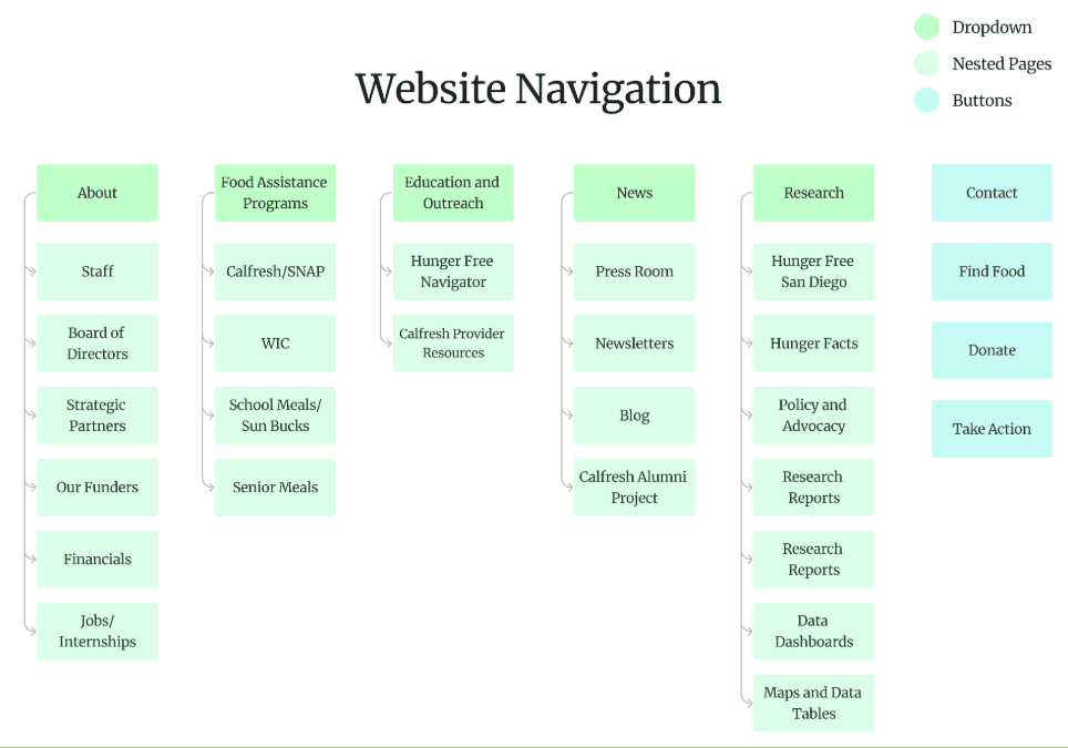
Website Navigation
UCD Process
Affinity Map
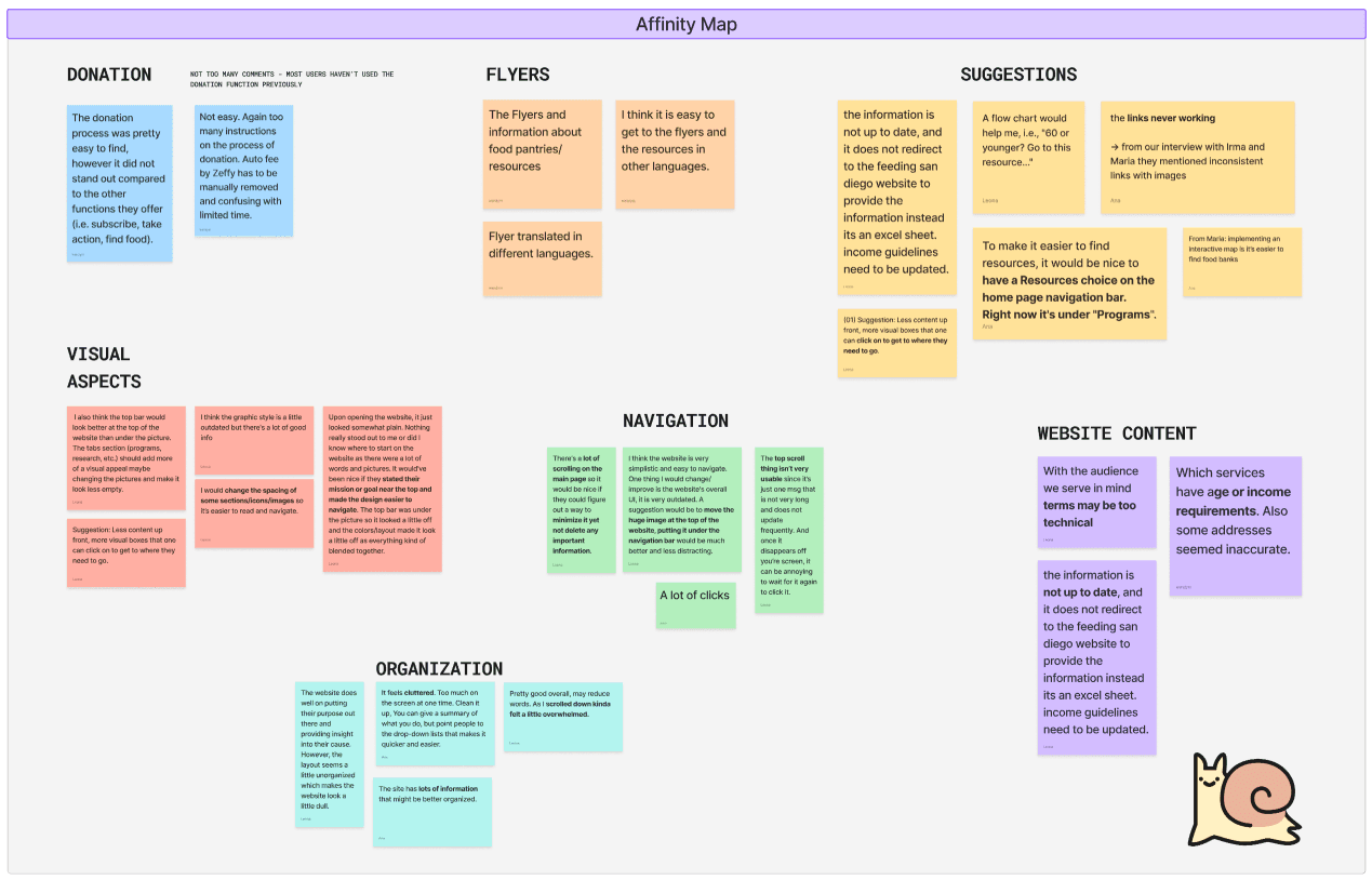
Based on survey findings, we created an affinity map to synthesize patterns from both the survey and interviews. Three main issues emerged: the site felt cluttered and difficult to navigate, the mission was not clearly communicated to the general audience, and the visuals lacked cohesion, making the organization’s purpose unclear. From these insights, two key problem areas stood out.
Under UI Aspects, users felt overwhelmed by excessive text and noticed inconsistencies in clickable elements—sometimes appearing as text links and other times as images. Under Organization and Navigation, users described the site as cluttered, requiring too much scrolling and clicking, and suggested breaking up dense content with clearer structure and links. Overall, the research pointed to the need for a cleaner layout, consistent interactions, and a more organized information flow.
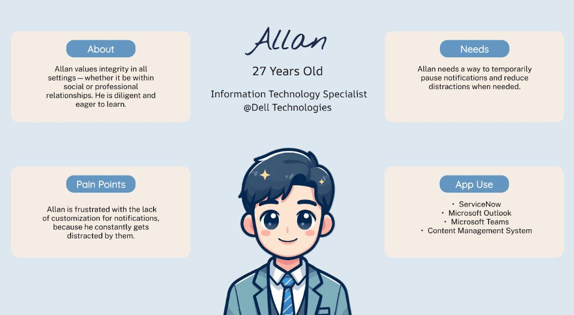
User Personas
UCD Process
Low-Fidelity Wireframing
Using insights from our research and ideation, our team created low-fidelity wireframes to map the updated user flow and interface improvements. While maintaining elements of the original layout for familiarity, the wireframes introduced key enhancements to navigation and content organization. This stage acted as a functional blueprint, allowing us to refine the information hierarchy and lay the foundation for a more seamless user experience.
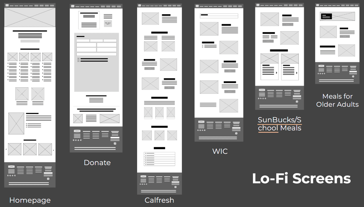
Wireframing
UCD Process
Iterative Prototyping and User Testing
Mid-fidelity prototypes were developed in Figma to visualize the website’s design and interaction flows. User testing sessions allowed participants to navigate realistic scenarios and provide feedback on usability, clarity, and overall experience. Insights from these sessions guided refinements to functionality and ensured the final design aligned with user needs before being implemented in Squarespace for SDHC’s full website redesign.
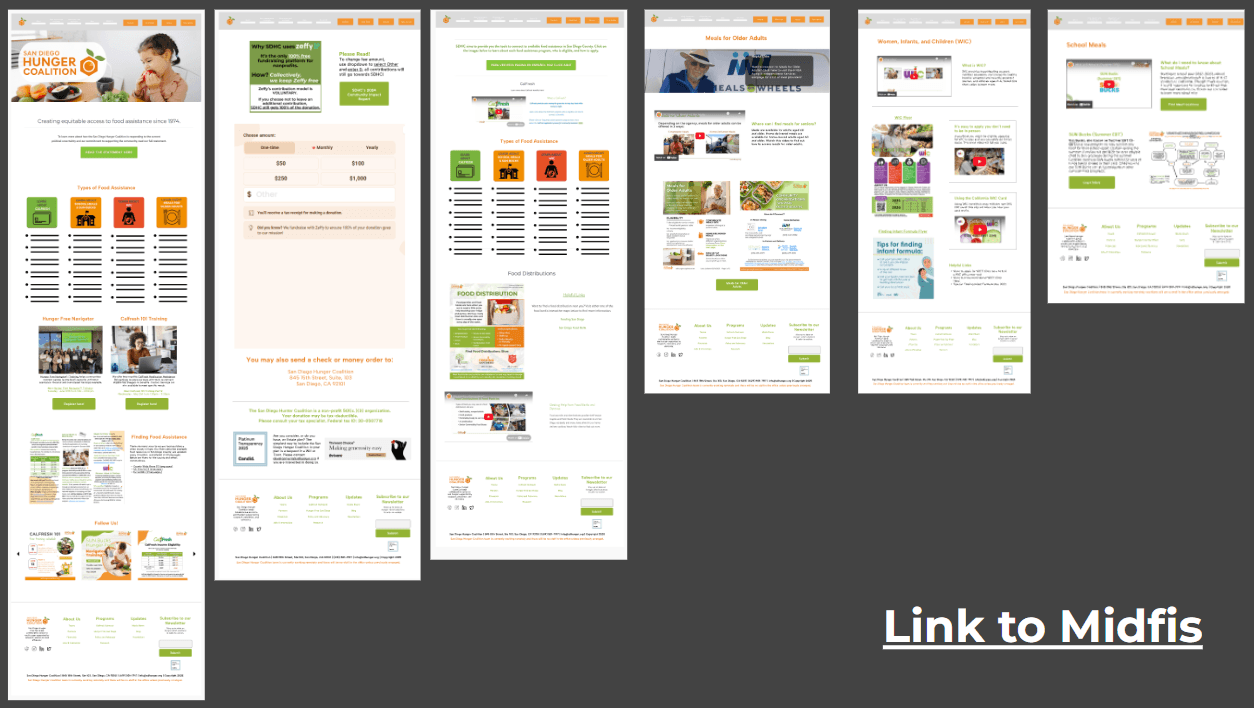
Wireframing
UCD Process
Final Redesign
After six months of work, we successfully delivered a full redesign of the SDHC website. The new site condenses pages, streamlines navigation, and clarifies the mission, making it easier for individuals to quickly find food assistance and for task force managers to access the tools they need to support their communities. This redesign not only improves usability but also strengthens SDHC’s role as a trusted resource and advocate for food equity.
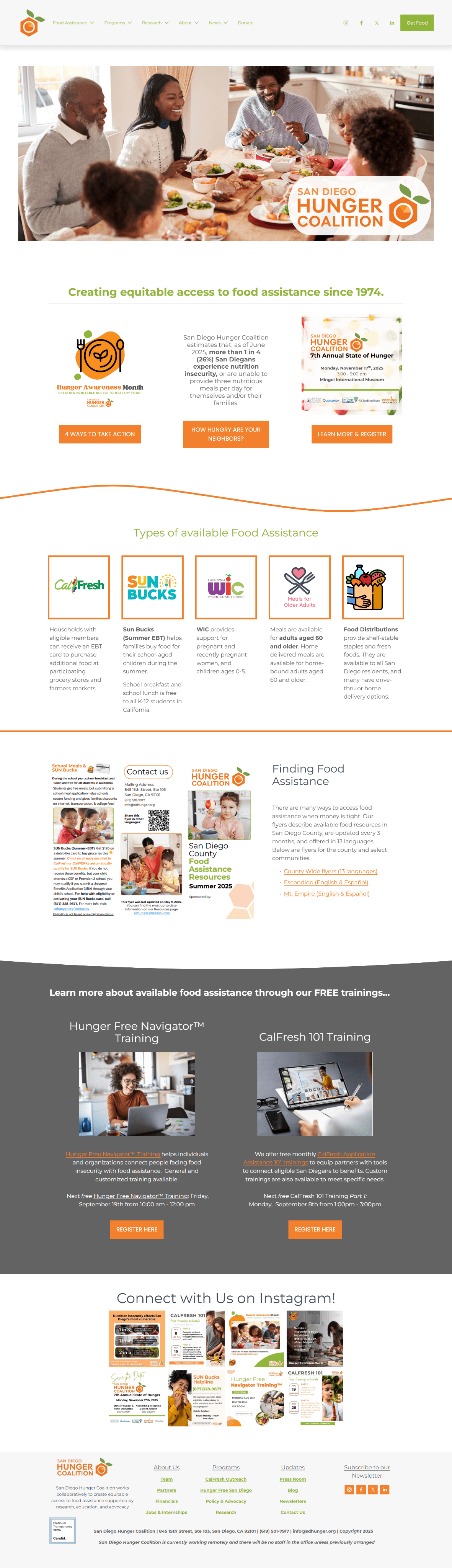
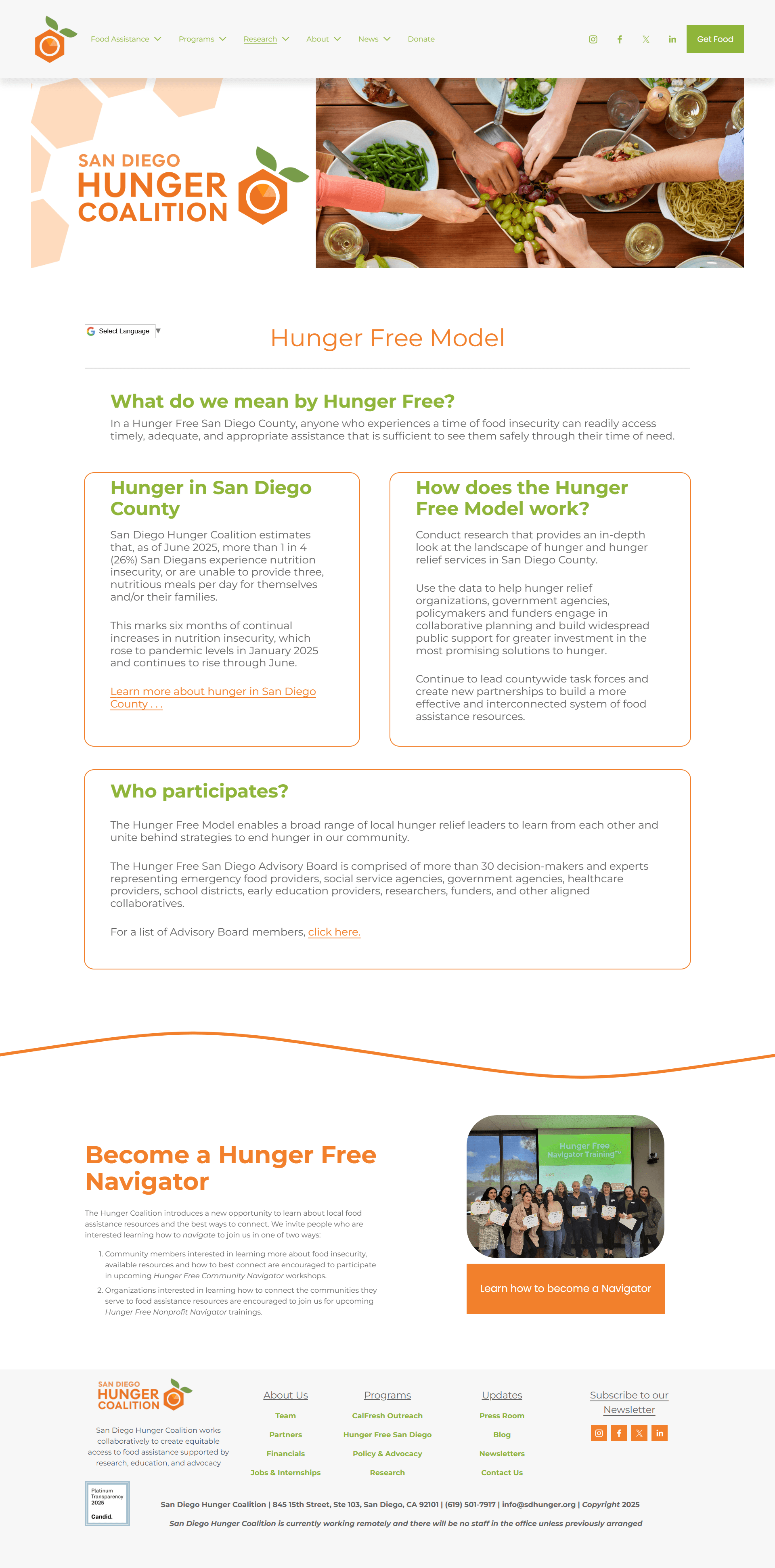
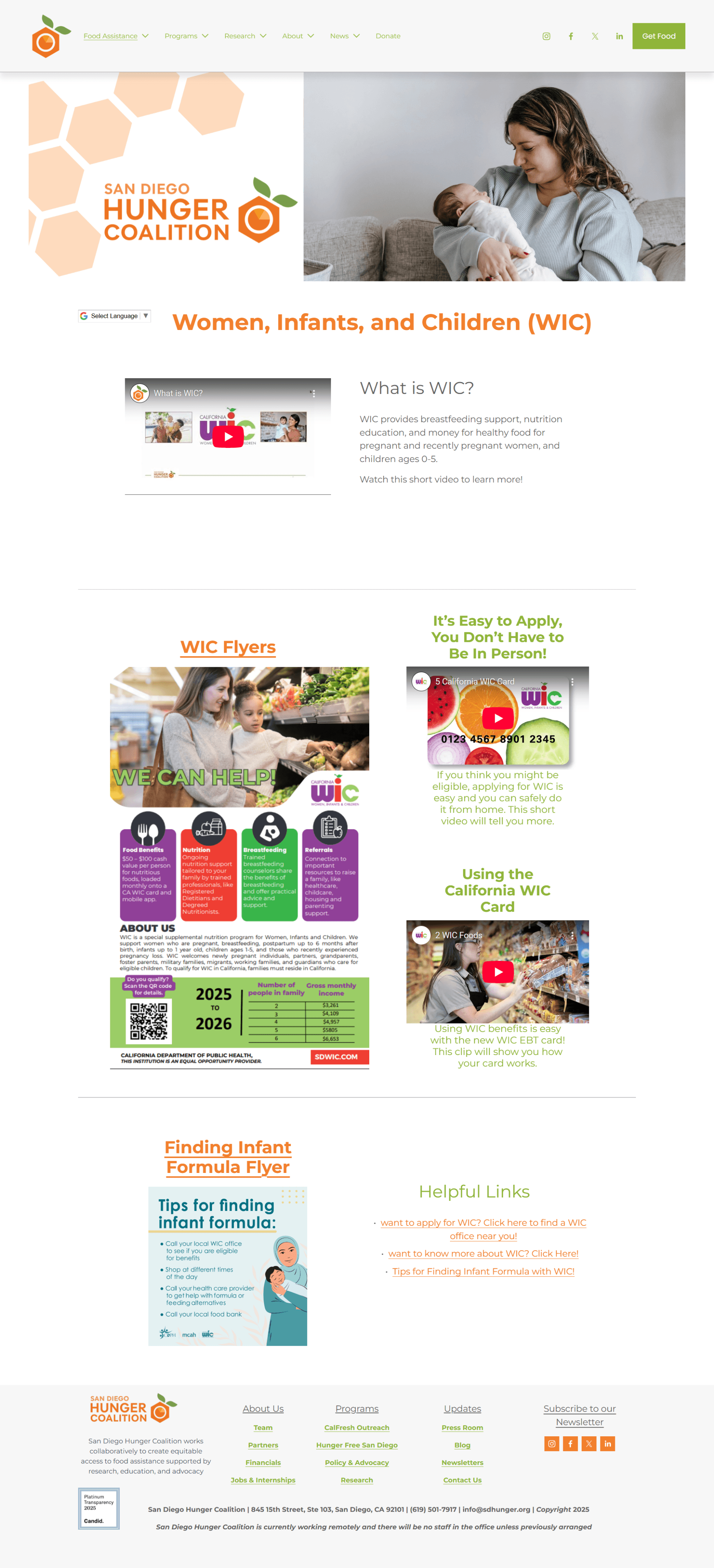
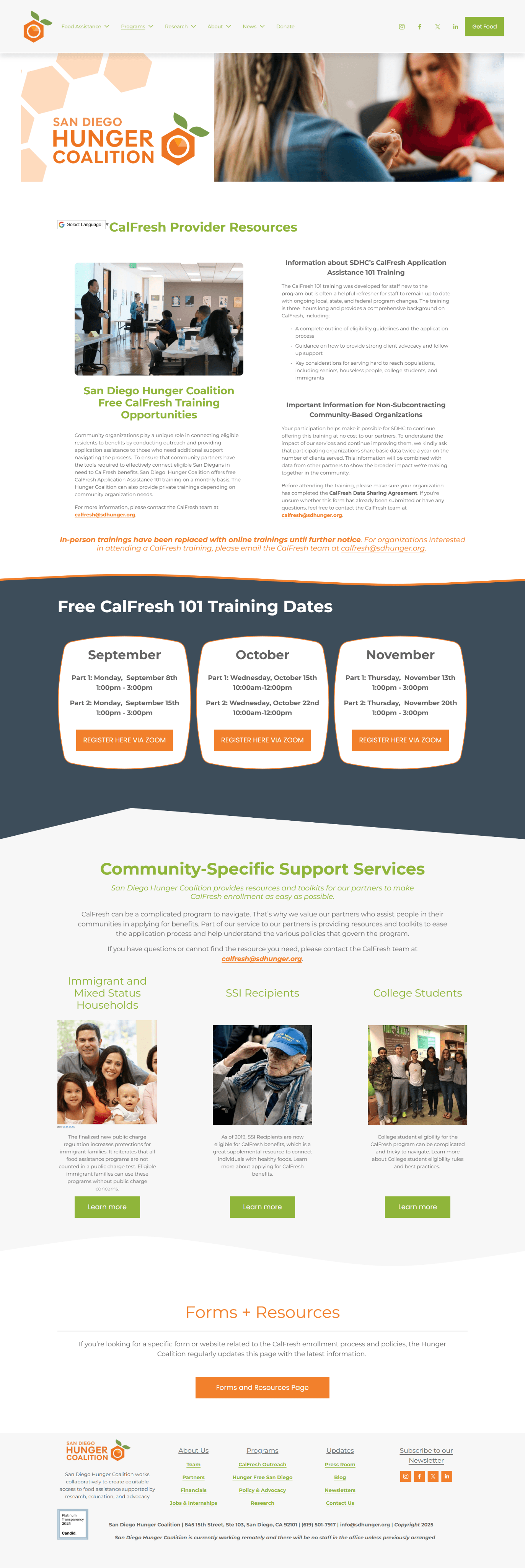
SDHC’s Redesign
Conclusion
Our redesign of the San Diego Hunger Coalition website demonstrates the impact of user-centered design in addressing real community needs. By conducting surveys, interviews, and stakeholder discussions, we uncovered core challenges in clarity, navigation, and content structure. Through wireframes, prototypes, and testing, we created a user-friendly site that makes essential resources more accessible to individuals seeking food assistance while providing partner organizations with tools to better serve their communities.
The final website not only clarifies SDHC’s mission but also enhances usability, reinforces trust, and strengthens the organization’s role as a leading advocate for food equity in San Diego County.
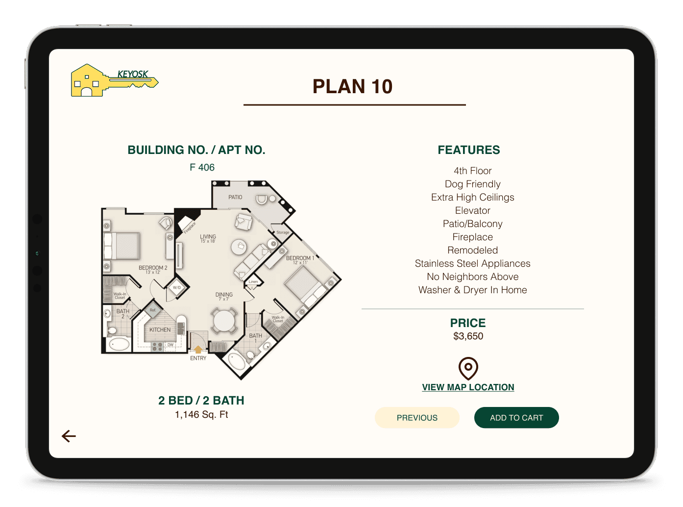
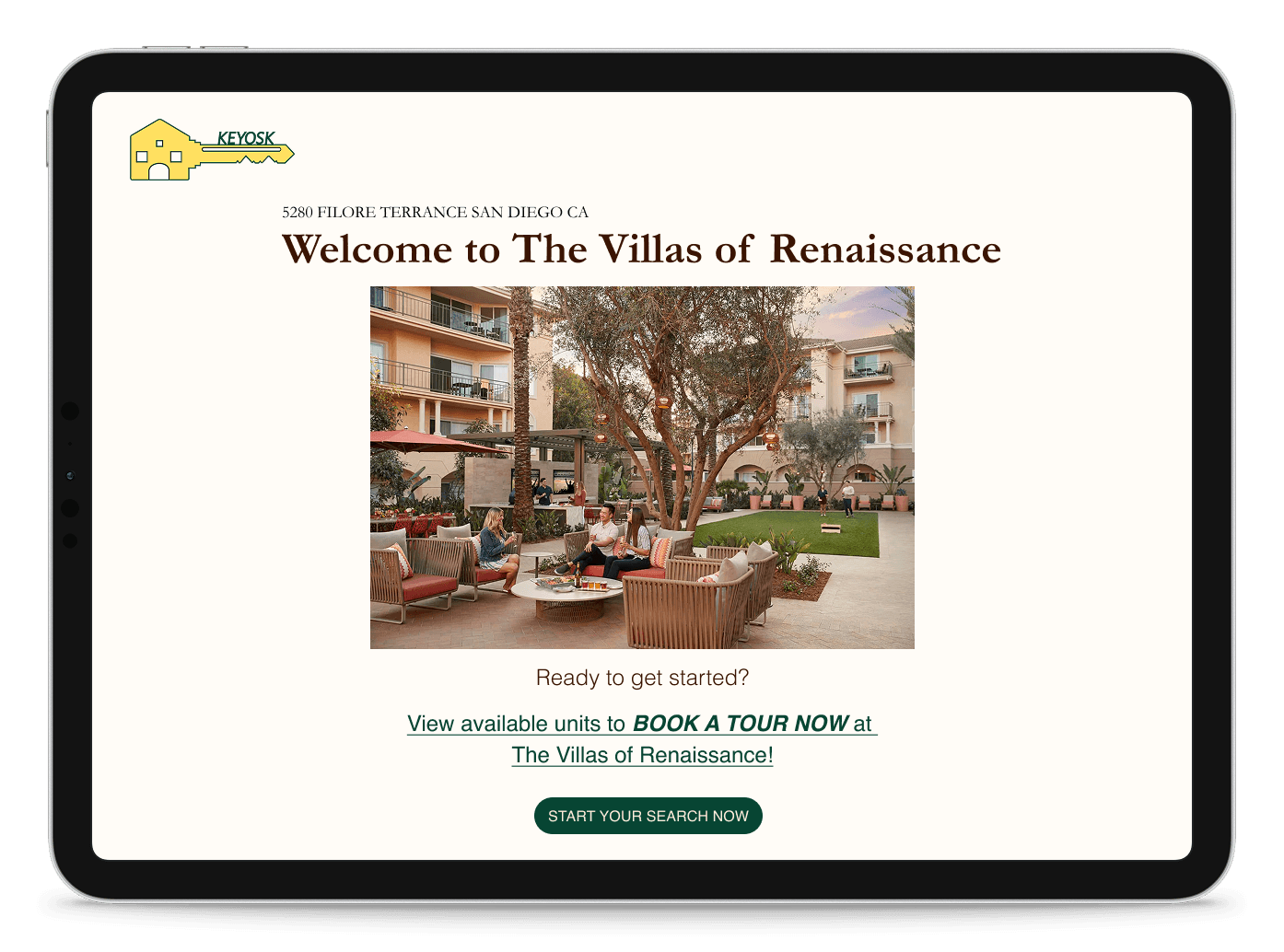
Leasing Office Kiosk App
KEYOSK
UX Design | UI Design | Tablet App Design
Website Redesign
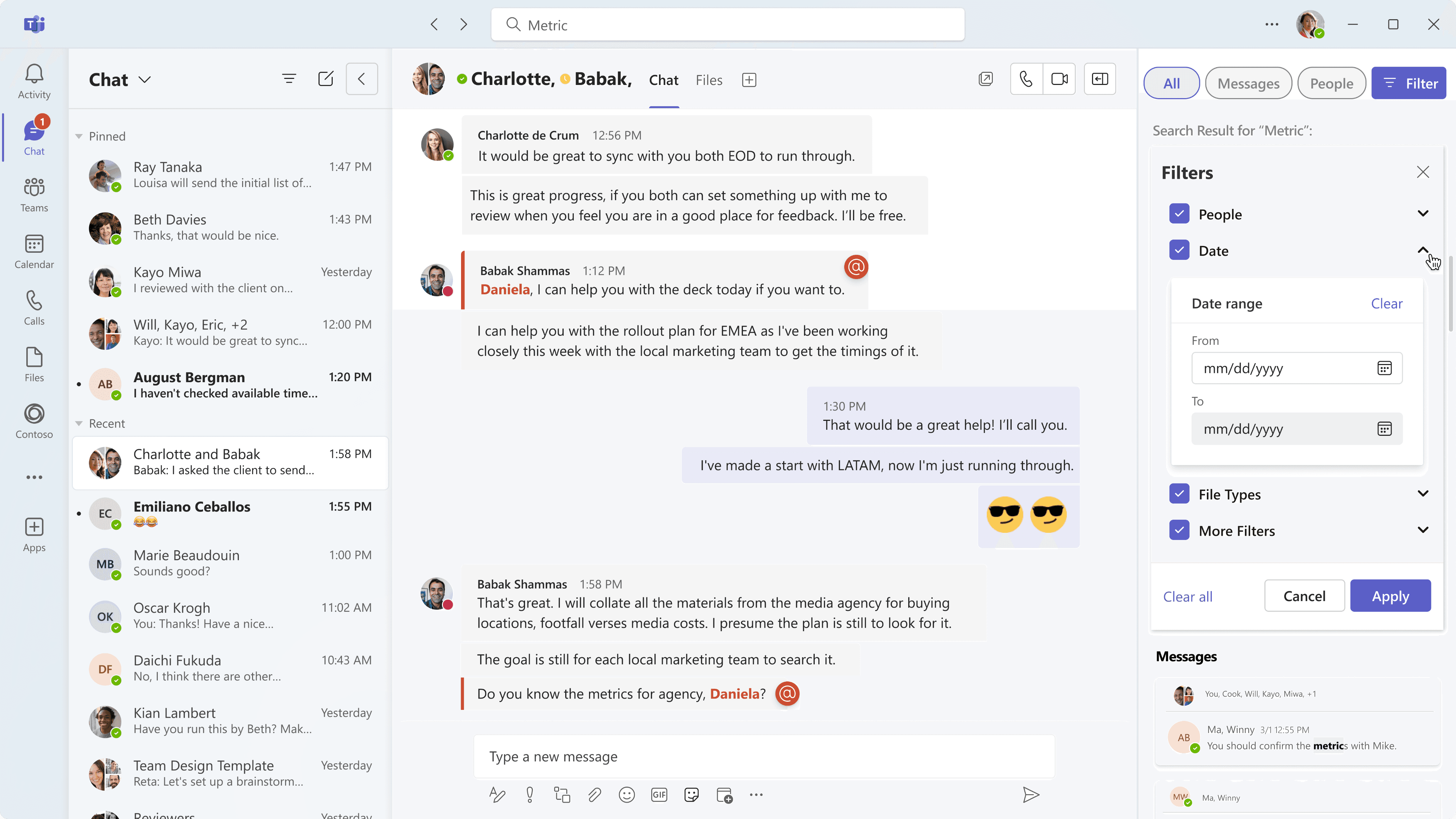
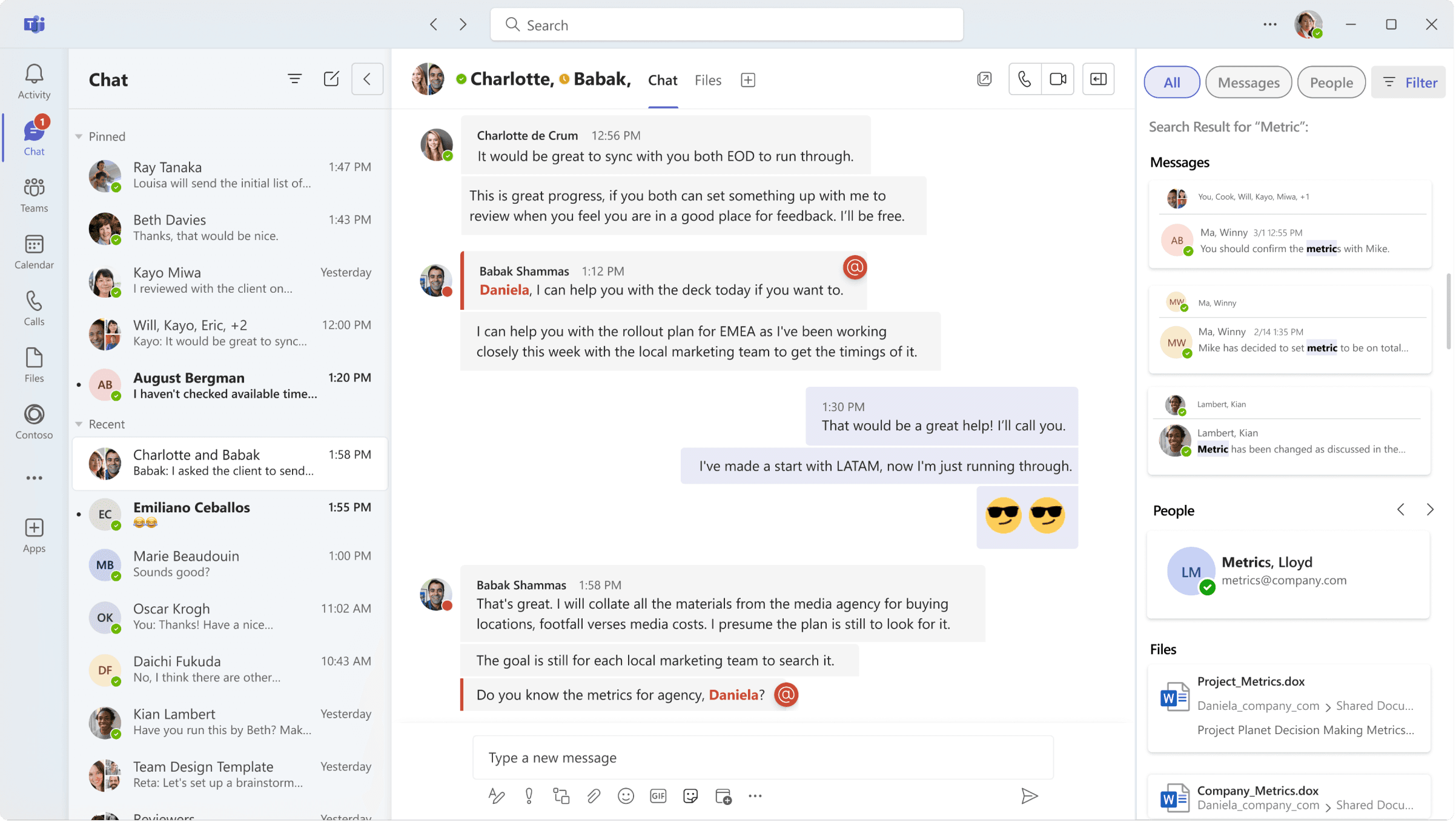
Mircosoft Teams
UX Design | UI Design | Desktop App Redesign
Thank You!
For sparing some time and review my work.
Get in touch with me

© 2024 By Leona Lai.
Privacy policy
Cookies policy