Overview
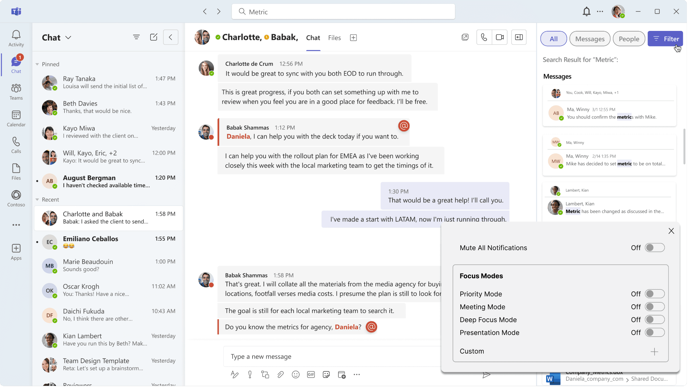
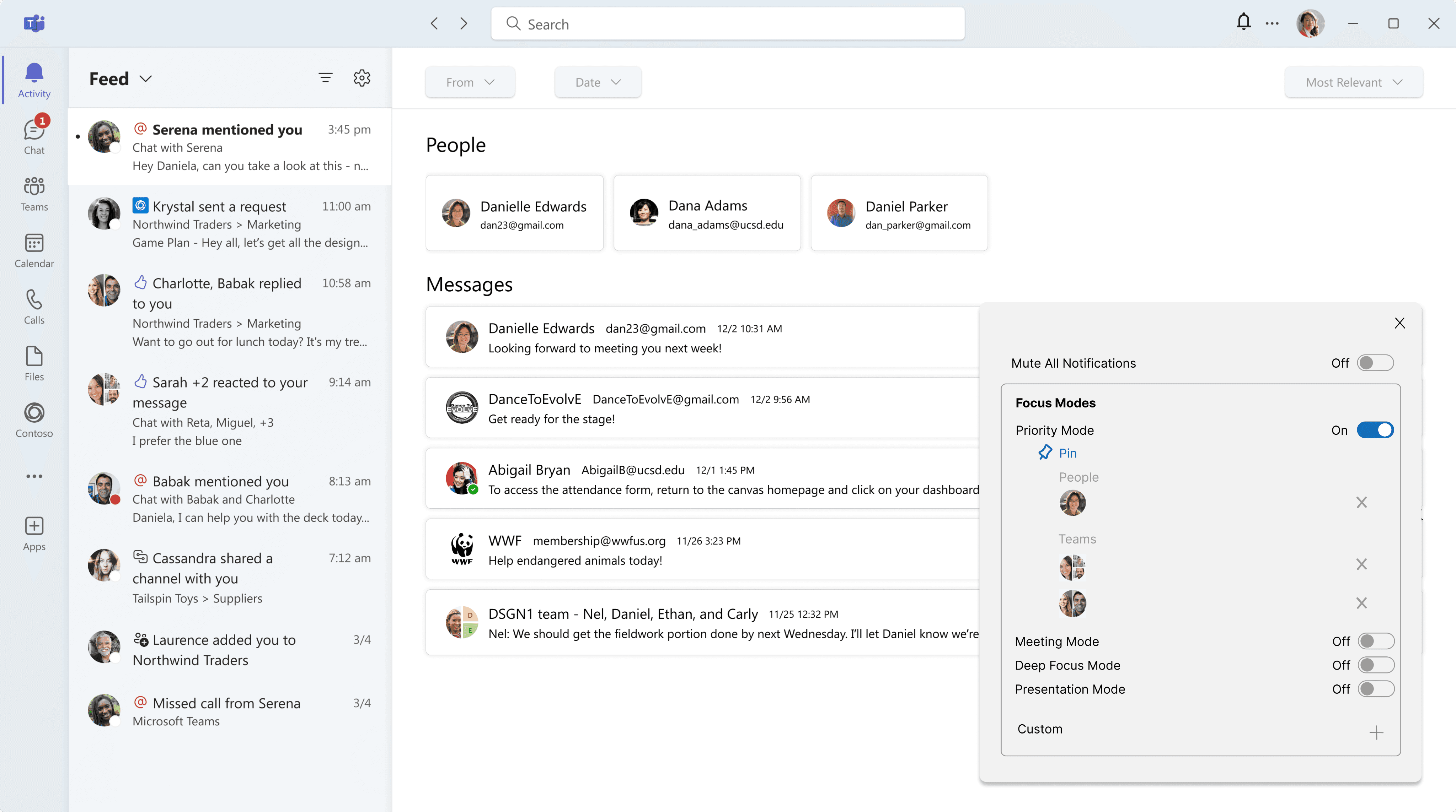
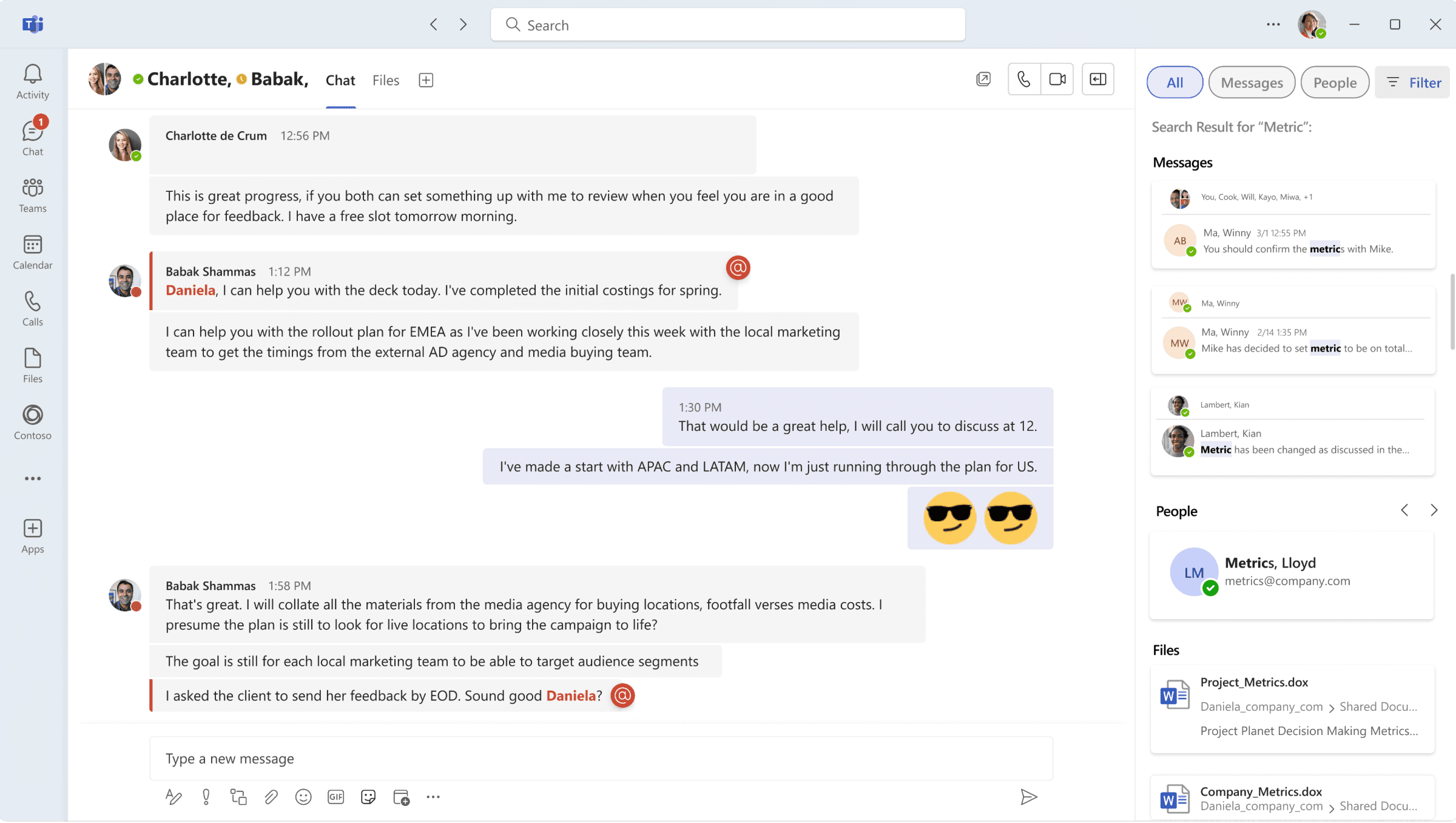
This UX redesign is tailored to the workflow of technical professionals with management responsibilities by addressing key pain points: excessive tab switching, inefficient information retrieval, and disruptive notifications. We developed a solution that integrates smarter search, flexible notification controls, and smoother tool transitions, all while preserving the core experience of Microsoft Teams.
Role
UX/UI Designer
Members
Julie Li, Aska Kunita Demirci, Cecilia Lin
Duration
3 months
Tools used
Design Process
Discover
Online Research
User Interviews
Competitive Analysis
Define
User Personas
Ideate
User Flow
Brainstorm Sketches
Design
Wireframes
Hi-Fi Designs
Prototype
UCD Process
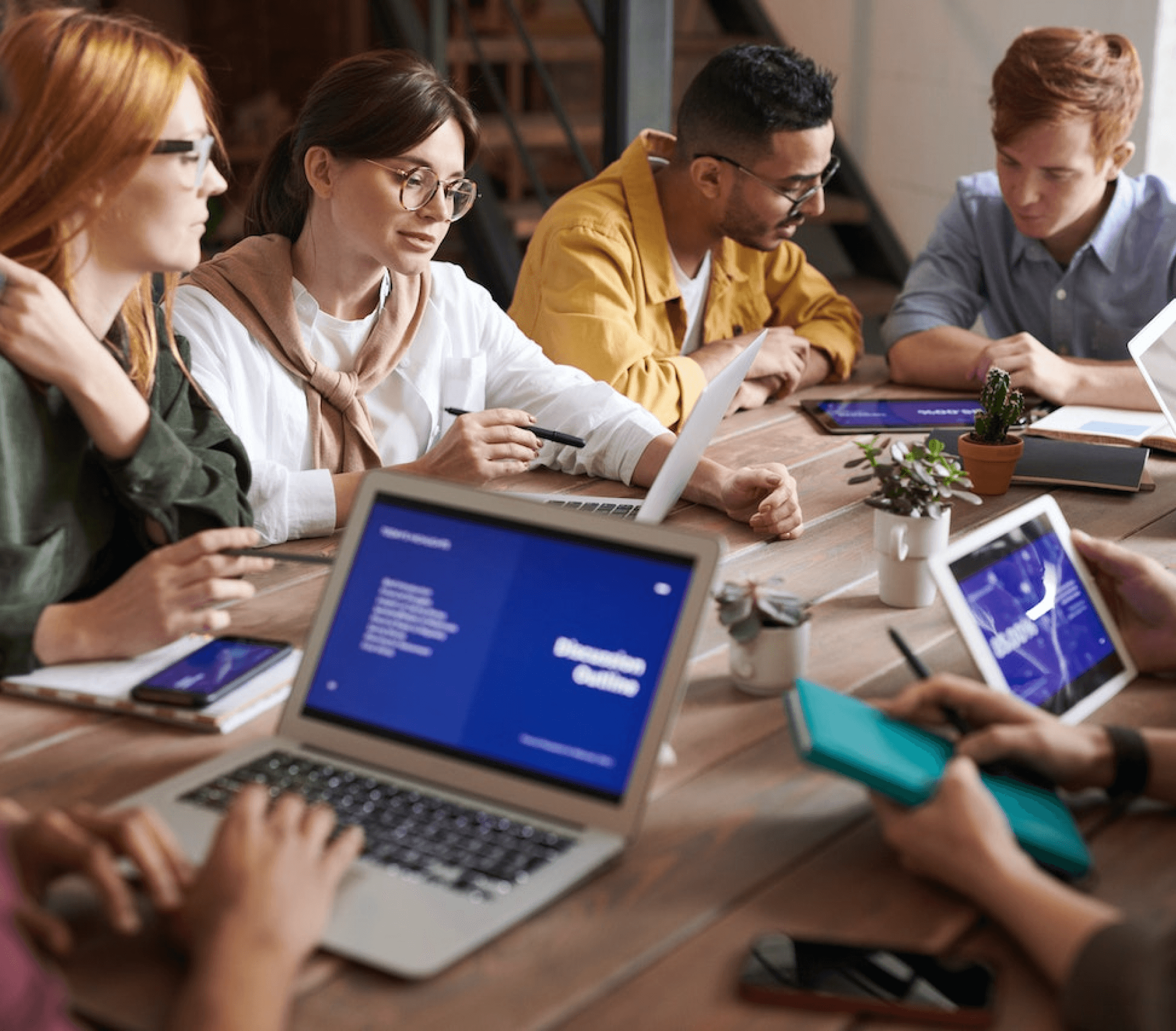
Research and Analysis
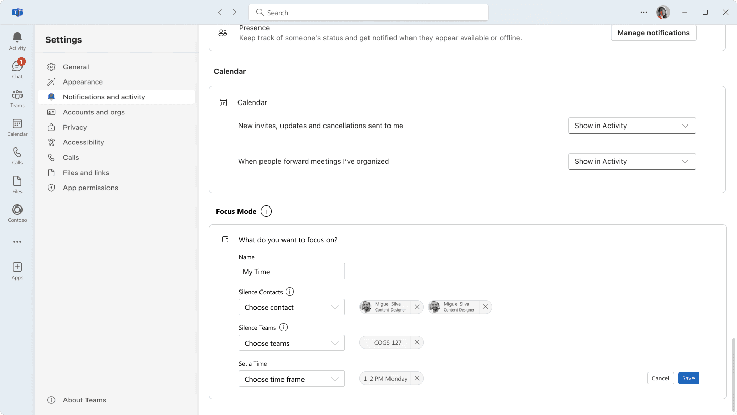
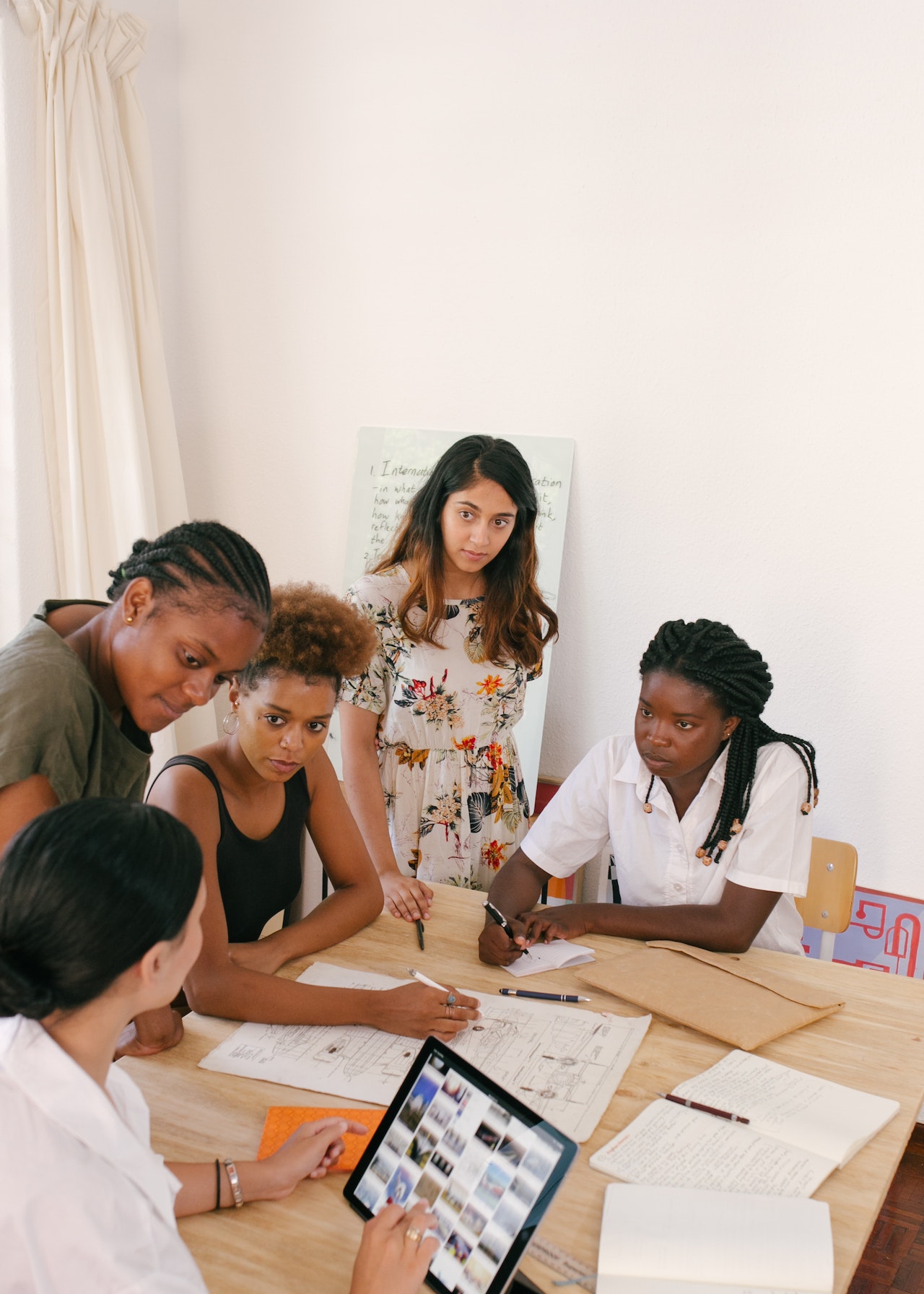
Our research involved user interviews and competitive analysis to understand the challenges tech professionals face in managing notifications and searching for information. Key pain points included constant interruptions, difficulty prioritizing alerts, and inefficient search. These insights informed the design of a customization notification UX flow—with features like mute, snooze, and mode selector—and an enhanced search experience using filters and a sidebar display, all aimed at reducing distractions and boosting productivity.


User interviews

Competitive analysis
UCD Process
User Personas
Based on research findings, this persona faces key challenges such as frequent tab switching, difficulty retrieving information efficiently, and interruptions from distracting notifications. Allan goals include staying focused on high-priority tasks, managing teams effectively, and accessing critical information quickly. To address these needs, we developed a solution that streamlines their workflow through smarter search functionality, customizable notification settings, and seamless transitions between tools—all while preserving the familiar core experience of Microsoft Teams.
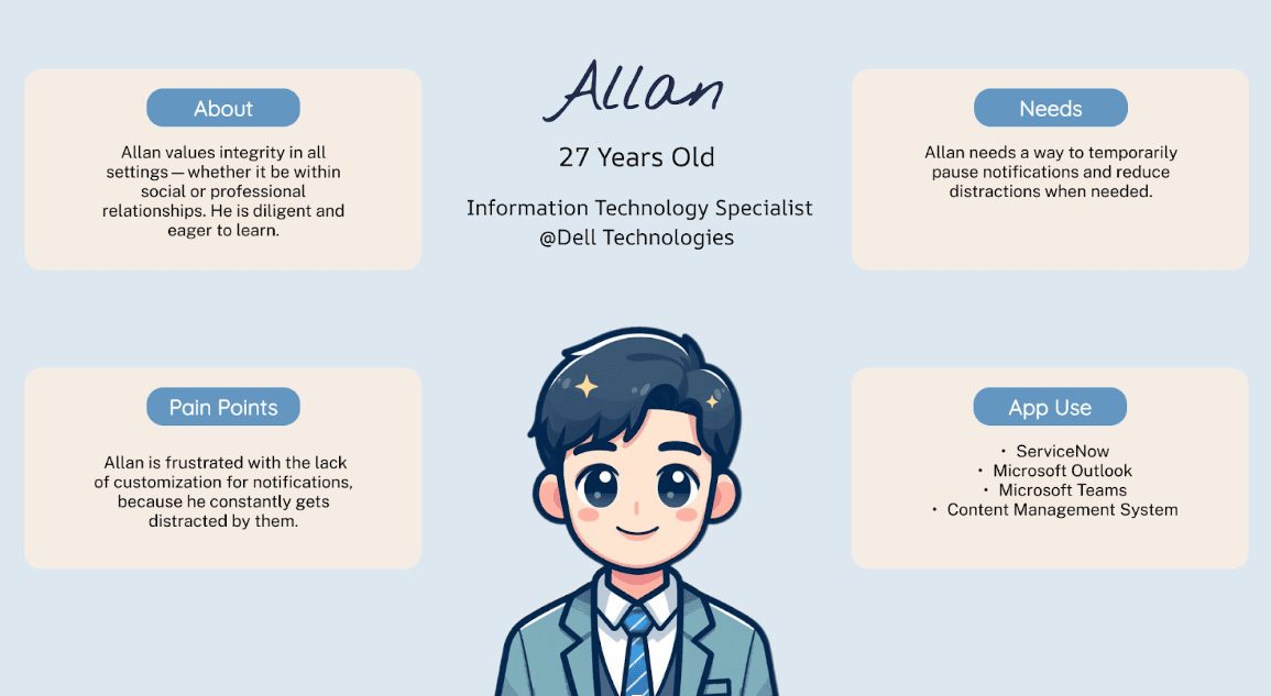
User Personas
UCD Process
Ideation and Concept Development
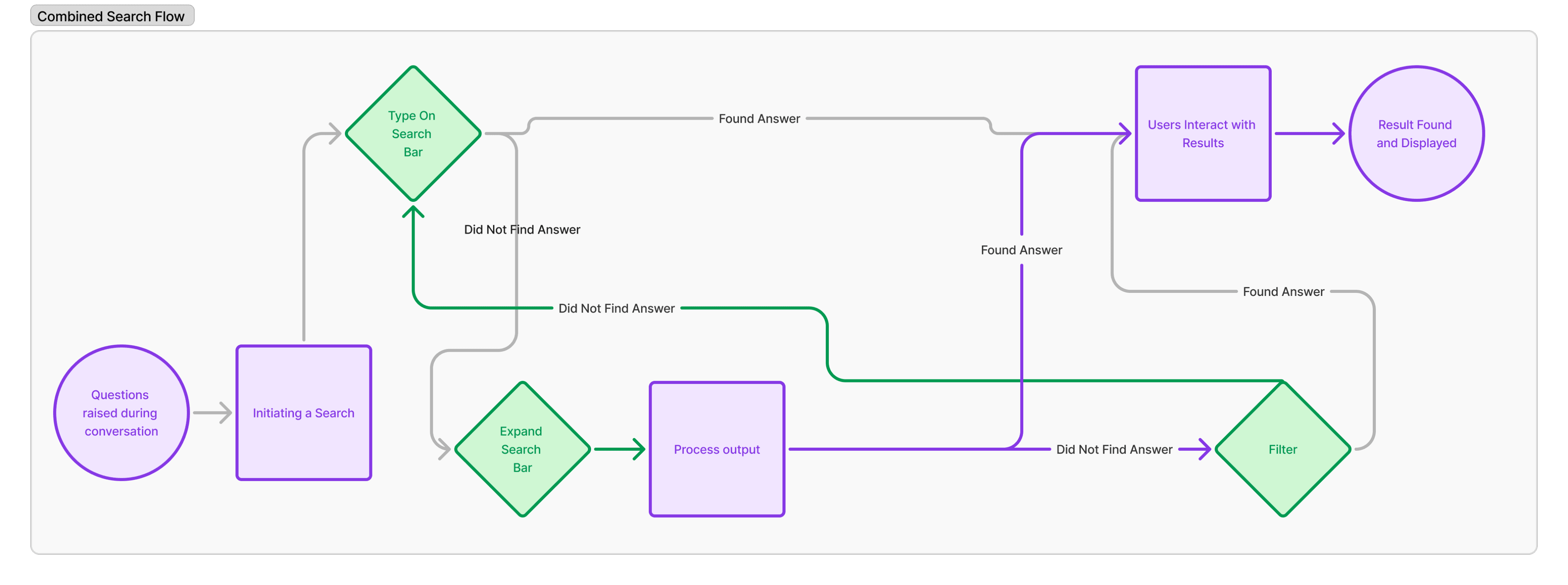
Our team held brainstorming sessions to explore ways to enhance multitasking and reduce workflow disruptions for tech professionals. Using design thinking methods, we focused on reimagining the search experience and notification settings to be more seamless and intuitive. Early UI sketches prioritized keeping users in their current workflow by enabling sidebar search results and adding accessible controls like a quick mute button. These concepts laid the foundation for a more responsive and efficient user interface that supports productivity without sacrificing usability.
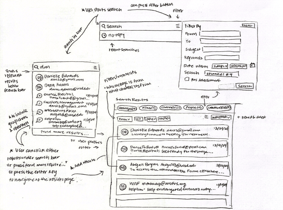
User Interface Sketches
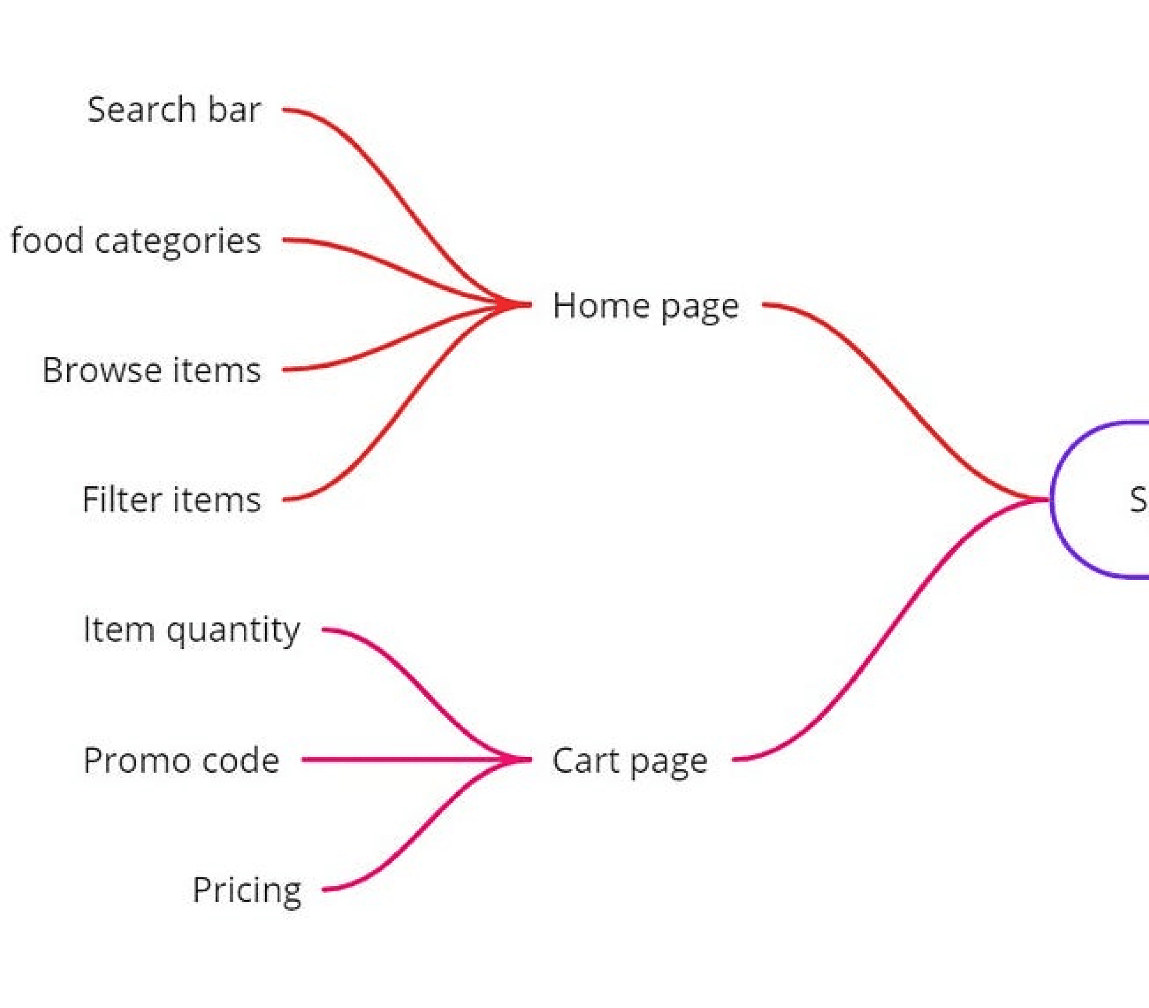
User Flows
UCD Process
Low-Fidelity Wireframing
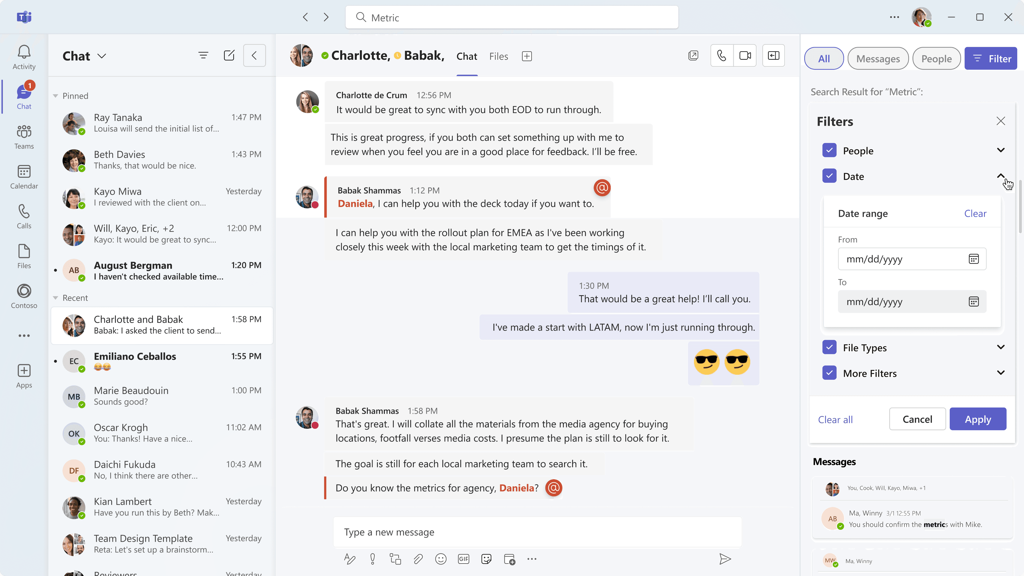
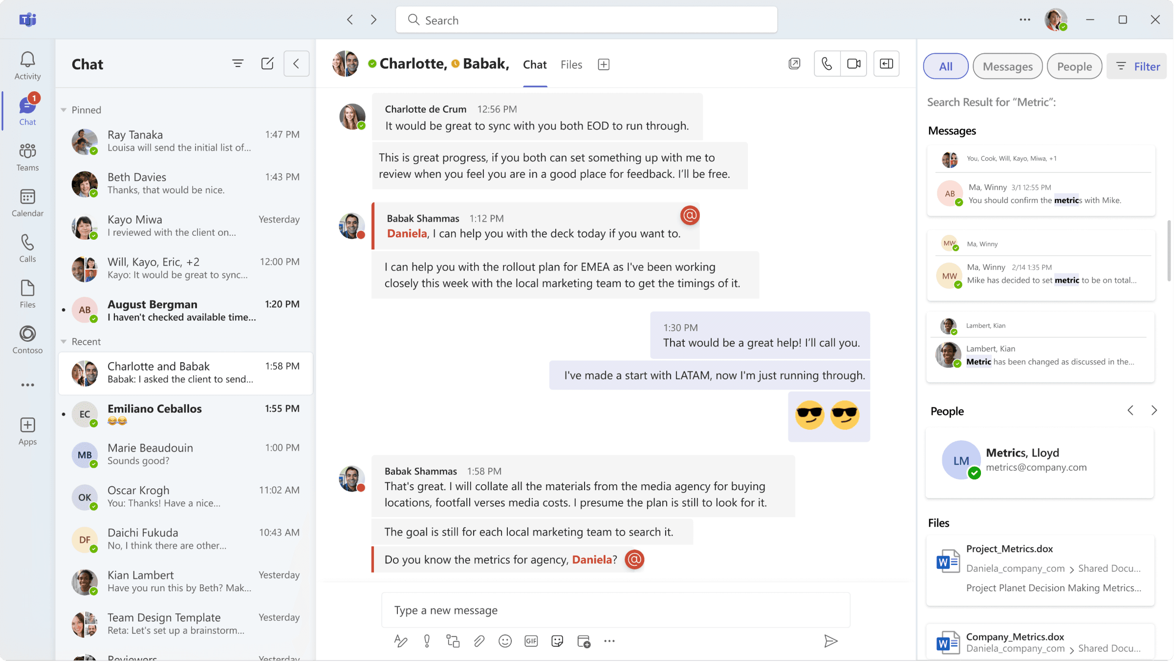
Using the insights gained from research and ideation, our team developed low-fidelity wireframes to outline the updated user flow and interface enhancements. These wireframes closely mirrored the original layout for familiarity but introduced key improvements—such as a collapsible sidebar to minimize recent chats and a more compact search dropdown for quick access. Selecting “Find More Results” opens a side panel with basic filters and relevant results, allowing users to stay in their current chat without disruption. This stage served as a functional blueprint, helping us refine the information hierarchy and ensure a seamless, multitasking-friendly experience.

Wireframing
UCD Process
Iterative Prototyping and User Testing
High-fidelity prototypes were created in Figma to visualize the app’s design, interaction flows, and transitions. These prototypes allowed users to explore the interface in realistic scenarios during testing sessions, where they provided feedback on usability, clarity, and overall experience. Insights from these sessions guided iterative refinements, helping to resolve pain points, enhance functionality, and ensure the final design met user needs and expectations.
UCD Process
Visual Design
With the needs of technical professionals in mind, the visual design phase for Microsoft Teams focused on enhancing clarity, usability, and brand alignment. The design team developed a refined visual system—incorporating Microsoft's established color palette, typography, and interface components, while introducing subtle improvements to support multitasking and reduce cognitive load. Visual consistency across screens and devices was prioritized to ensure a seamless experience, especially when navigating between chats, search, and notifications.
High-Fidelity
Conclusion
The Microsoft Teams redesign was guided by a user-centered design process aimed at improving the experience for technical professionals managing complex workflows. Through in-depth user research, ideation, prototyping, and iterative testing, the redesign addressed key pain points such as disruptive notifications, inefficient search, and frequent context switching. The result is a more streamlined, intuitive interface that enhances productivity, supports multitasking, and aligns with user expectations. This case study showcases the UX/UI designer’s ability to deliver a refined, user-focused solution that strengthens engagement and usability within a widely used enterprise platform.



© 2024 By Leona Lai.
Privacy policy
Cookies policy