Overview
Managing kitchen inventory is often a chaotic, time-consuming process, especially for fast-paced restaurant teams juggling prep, delivery, and storage. Our team set out to redesign an inventory management experience tailored for the specific needs of kitchen staff, line cooks, and managers.
PrepTrack was developed as part of a COGS 187A project at UC San Diego, with the goal of creating a simple, efficient, and intuitive system to support daily inventory tasks. Through user research, usability testing, and iterative redesigns, we created a system that streamlines restocking, locating items, and identifying low stock, without adding cognitive overload to an already demanding kitchen environment.
Role
UX/UI Designer
Members
Serene Wang, Mary-Ann Huang, Joonwoo Park, Rayleen Marquez
Duration
2 months
Tools used
Design Process
Discover
Online Research
User Interviews
Define
User Testing
User Research
Ideate
Information Architecture
Redesign Research
Design
Low-Fi Designs
Hi-Fi Designs
Prototype
UCD Process
Research and Analysis
In a busy kitchen, inventory management goes beyond tracking quantities—it must support quick ingredient retrieval, seamless updates, and role-specific coordination under pressure. For this project, we redesigned an inventory system based on real workflows in a restaurant, focusing on how it’s actually used rather than fixing flaws in existing tools. Our research identified four key user roles—receiving staff, line cooks, managers, and new staff—each with distinct needs and touch points. We centered our design around minimizing friction in repetitive tasks, using clear cues to highlight urgent issues, and streamlining information without overwhelming the user, aiming for a solution that balanced clarity, speed, and accessibility in daily use.

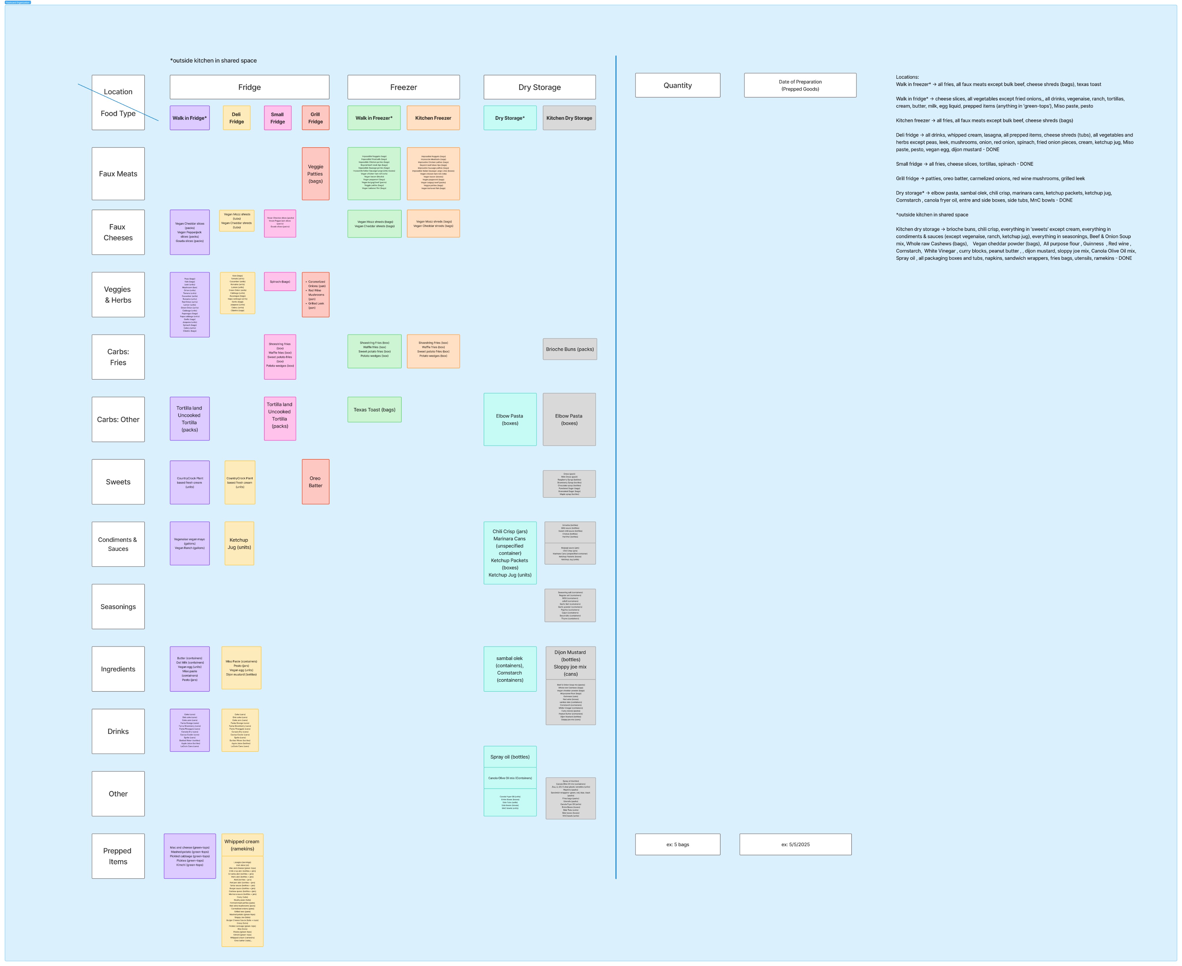
Information Architecture Flashcard
UCD Process
Redesign Decisions
Based on user feedback, we iterated on several components in the interface to improve clarity and ease of use. Below are key redesign decisions:
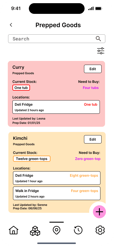
Edit Button Visibility
Before: Users struggled to recognize the “⋯” icon in the top-right corner of each inventory item.
After: We replaced the icon with a clearly labeled “Edit” button, reducing hesitation and making the editing process more intuitive.
Quantity Input Control
Before: Arrow buttons for adjusting quantity were small and hard to tap, especially on mobile.
After: We increased the touch area and used more prominent arrows to improve usability.
Color Coding System
Before: Some users were unsure what red/yellow/green backgrounds meant.
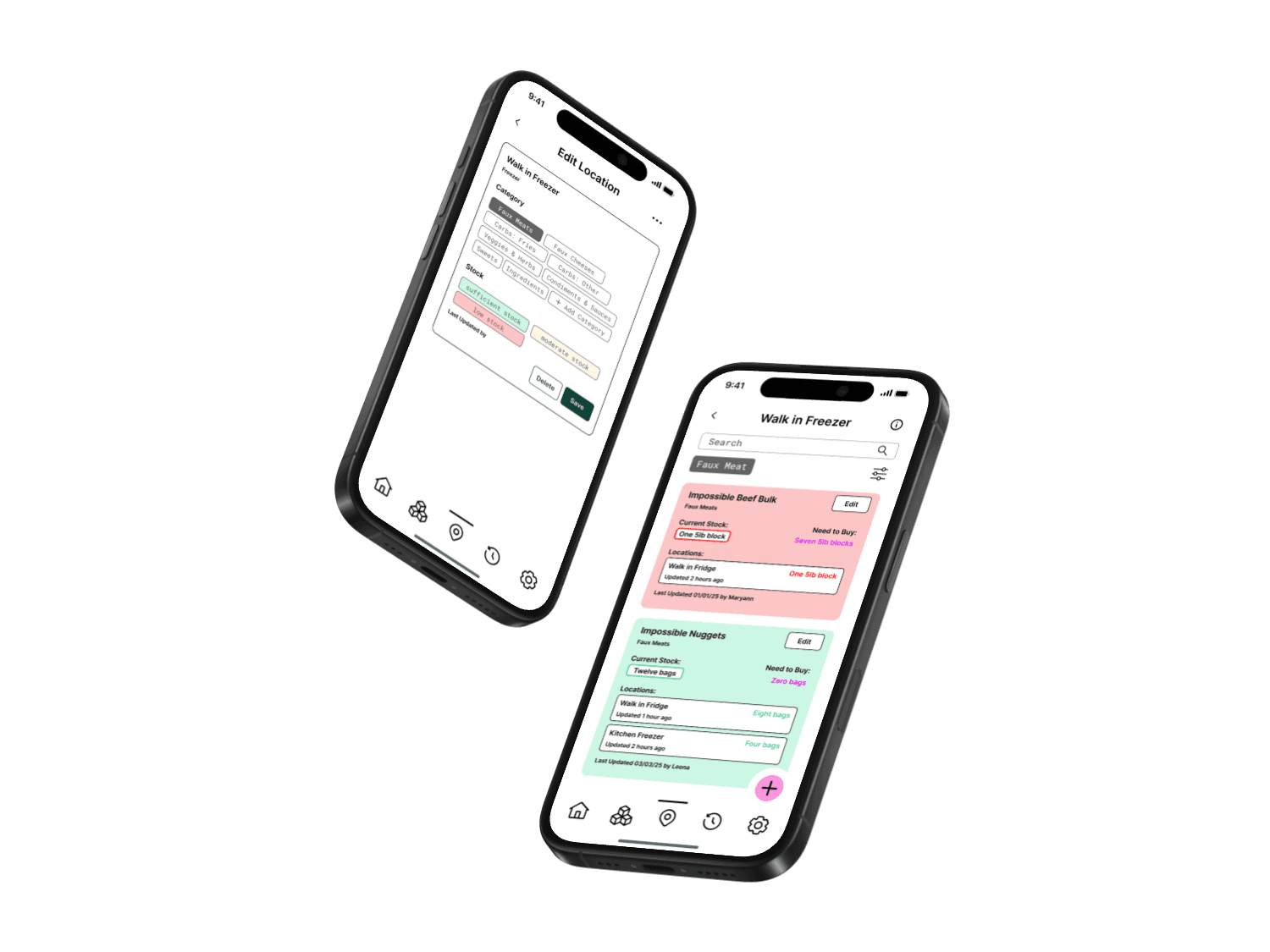
After: We added a color key to explain the visual system, reinforcing the urgency of low-stock items (red), moderate levels (yellow), and sufficient stock (green).
Filter Reset Option
Before: Testers had trouble going back to the default unfiltered view.
After: A reset button was added to allow users to return to the original screen state without confusion.
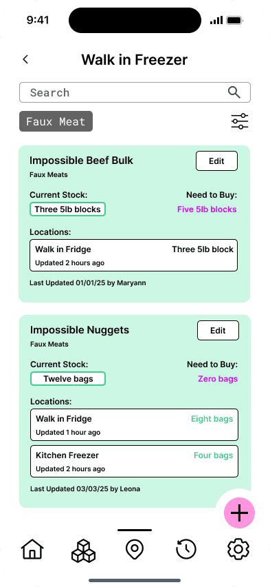
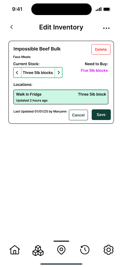
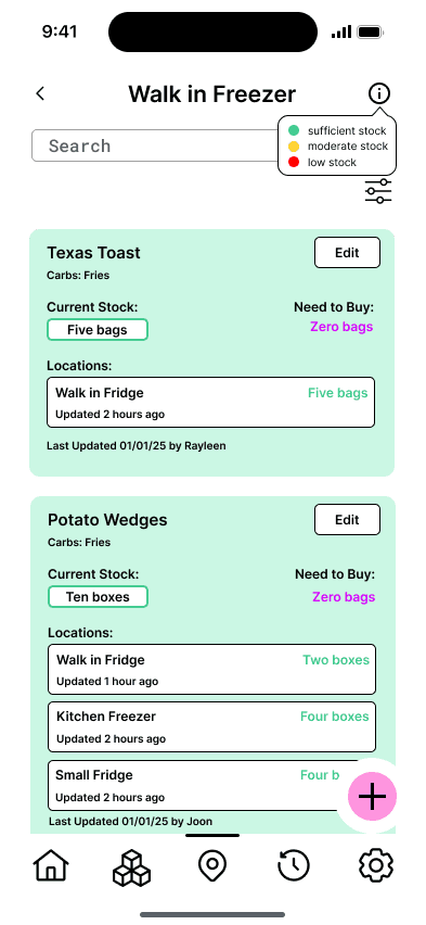
Edit Button Visibility, Quantity Input Control & Color Coding System
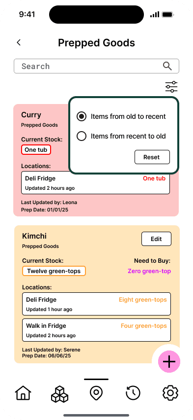
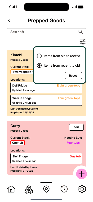
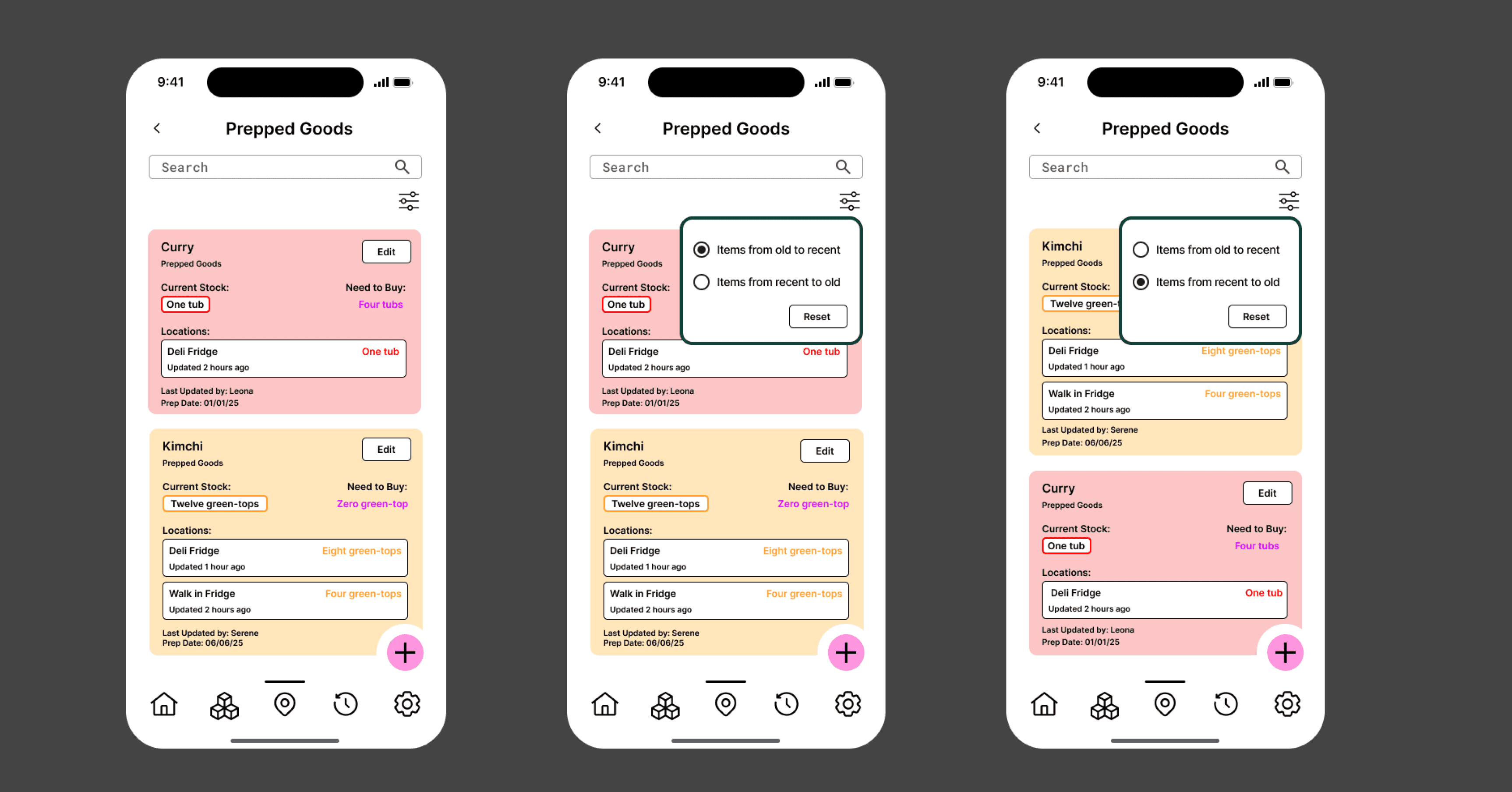
Filter items by Prep Date with Reset Option
UCD Process
User Research and Testing Insights
We conducted user testing with UC San Diego participants, who completed role-specific tasks using either a spreadsheet prototype or early app wire frames, while we observed their actions and gathered feedback through screen sharing and verbal comments. These findings directly shaped our redesign, driving improvements in clarity, structure, and filter functionality.
Key insights included:
Clarity of Interaction: Users found some interface elements (e.g., the “⋯” icon for editing) unclear. Many preferred explicit buttons with clear labels like “Edit Item”
Visual Hierarchy: Multiple users had difficulty keeping track of column headers while scrolling. This suggested a need for fixed headers and better structural organization
Filter Friction: Some testers struggled to reset filters or identify what was currently being filtered. A more obvious “Reset Filter” action was requested
Color Coding Effectiveness: The color-coded dropdowns for stock levels (e.g., red = low, green = stocked) were positively received, especially among closing staff, who relied on quick visual cues
Expiration Management: Users recommended better date-based sorting or color-coded expiration indicators to avoid outdated items being missed
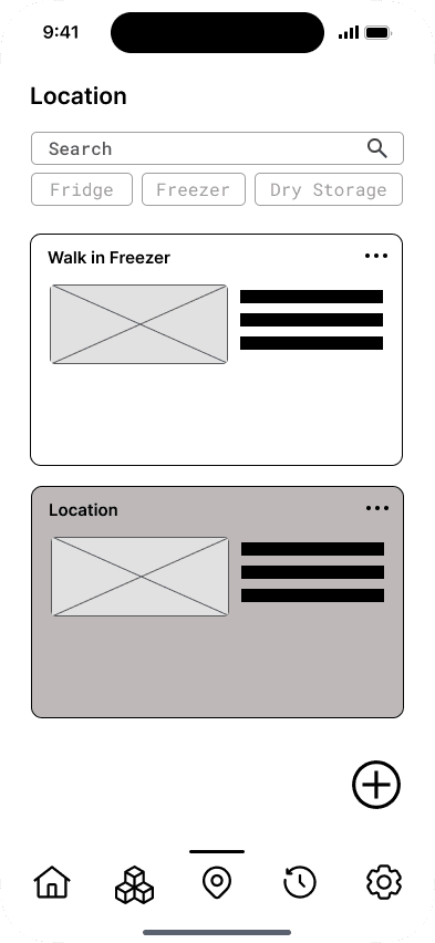
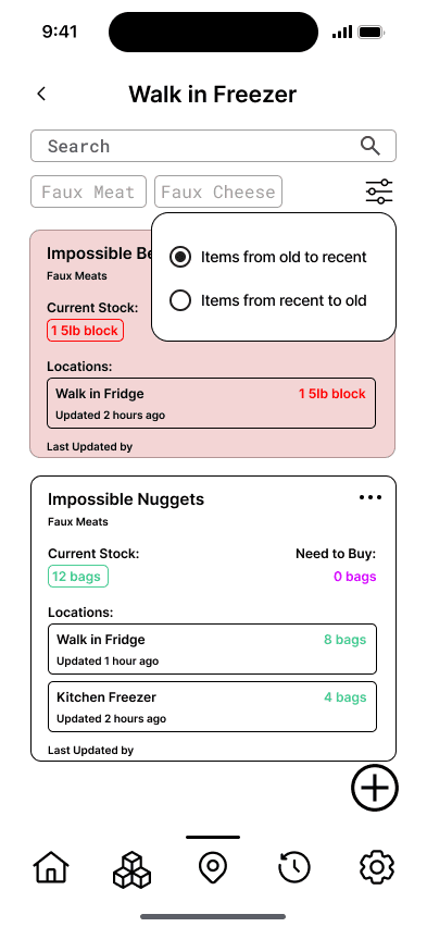
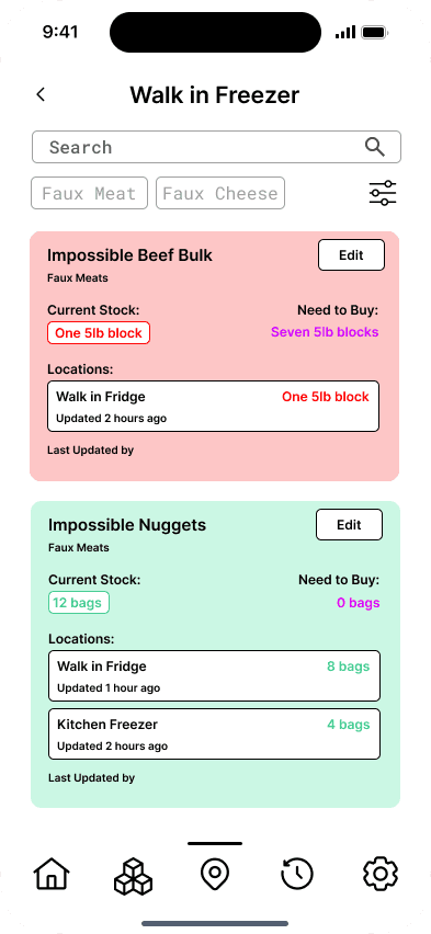
Initial Design Snapshots of PrepTrack
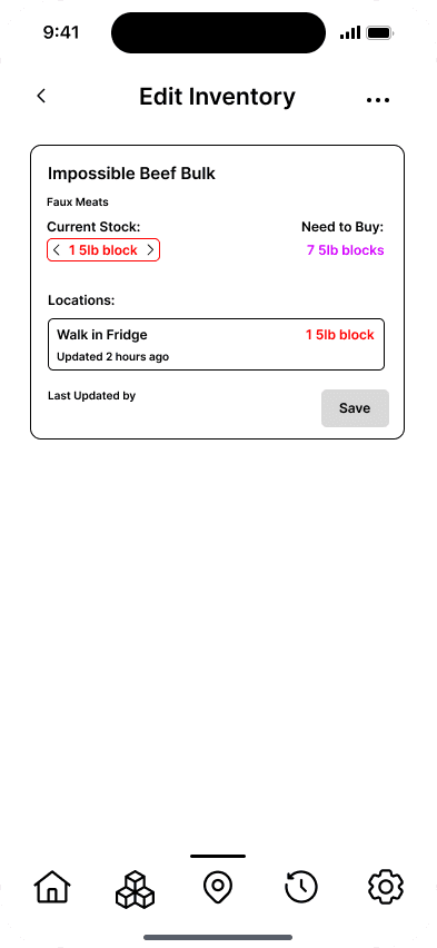
Initial Design Snapshots of PrepTrack
UCD Process
Final Design Scenarios
To demonstrate how PrepTrack supports real-world kitchen workflows, we developed two scenarios based on user testing tasks. These reflect updates to the UI with a focus on clarity, efficiency, and ease of use.
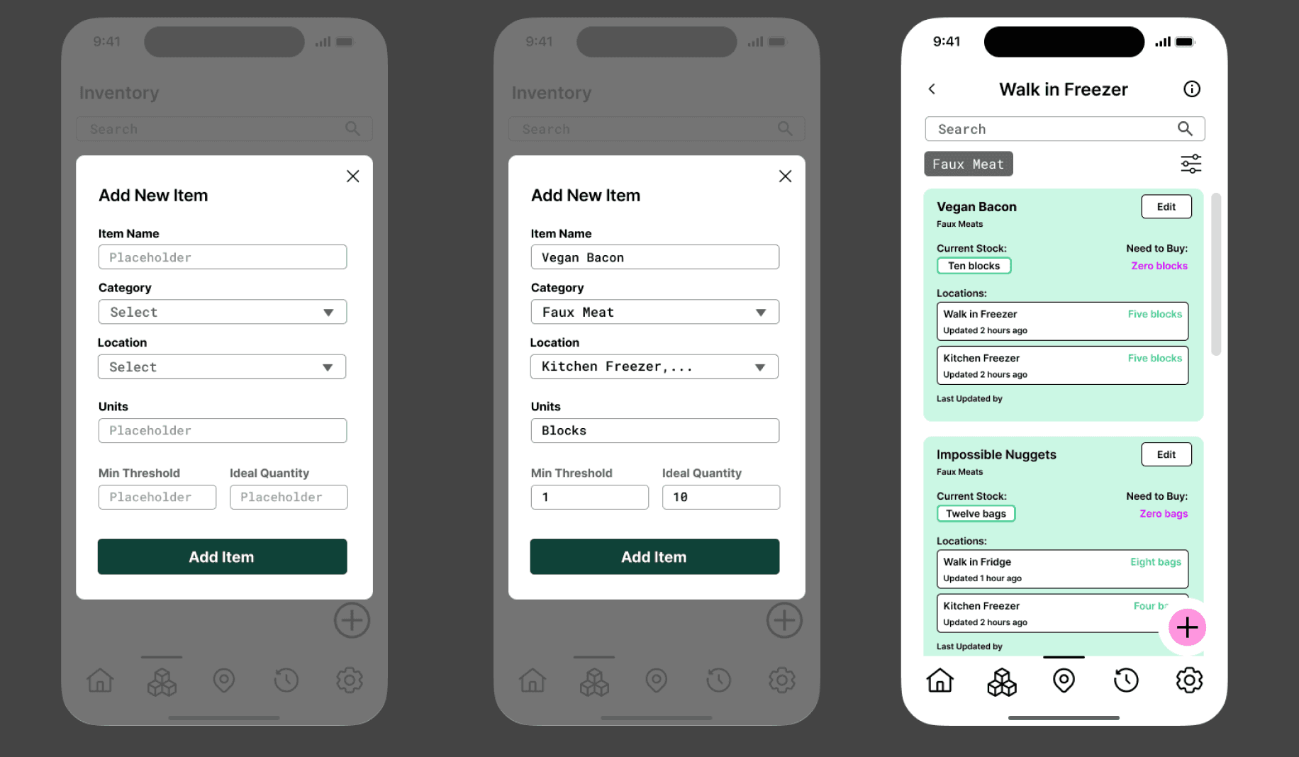
Scenario 1: Editing Stock (New Kitchen Staff)
A new staff member updates the inventory for “Impossible Beef Bulk” by using the search bar, selecting the item, and tapping the clearly labeled “Edit” button (replacing the previous icon). After selecting the relevant storage location, the user inputs “Three 5lb blocks” and taps “Save.” The updated design emphasizes ease of navigation with dropdown menus, location-specific item views, and helpful placeholder text, streamlining data entry and reducing confusion. Users can also add or delete items within any location or category via clearly marked buttons.
Scenario 2: Reviewing Low Stock for Reordering (Kitchen Manager)
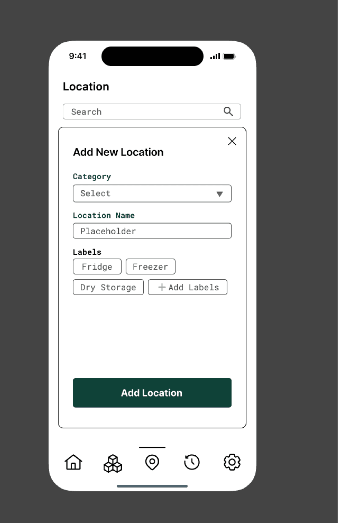
A manager filters prepped goods by date, scans for color-coded indicators (red/yellow for low stock), and clicks into item details (e.g., Curry, Kimchi) to confirm quantities and reorder as needed. The interface highlights critical items with a “Need to Buy” label, and displays key information such as prep dates, ideal quantities, update timestamps, and the staff responsible for updates. A prominent “Add” icon enables quick addition of new locations or item categories via dropdowns.
Additional Features
The “Home” page offers a dashboard-like summary, displaying low-stock alerts, expiration dates, storage locations, and recent updates. Selecting the “Low Stock” section leads directly to a focused, actionable list—ensuring fast, intuitive access for busy kitchen environments.
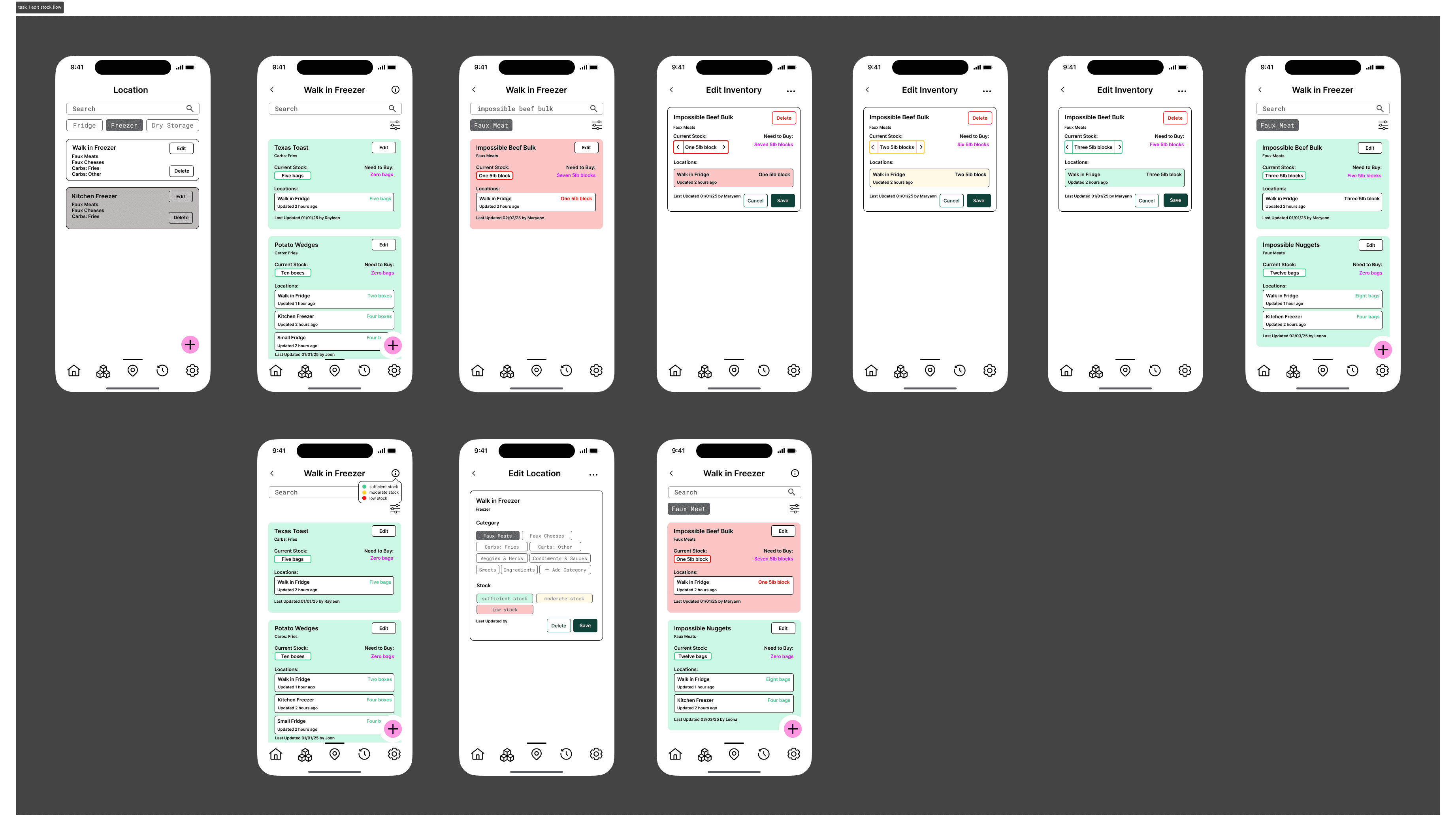
Scenario 1
Scenario 2
Conclusion
For future direction, more iteration on the logistics of the app would be helpful. Specifically, the home screen’s UI could be better implemented and include a calendar for the expiring soon section. In addition, organizing and fully utilizing the bottom navigation bar would be helpful for maximizing the functionalities of the app. Perhaps the app could have features set to custom role selection of the user, allowing different professions to customize what functions they use the most. Lastly, having more incorporation of brand colors would help the aesthetic appeal of the app, although I think the UI should still have a minimalist look to it. By conducting additional tests on the high-fidelity prototypes, we can better understand how to improve the usability for our clients.


© 2024 By Leona Lai.
Privacy policy
Cookies policy

Website Redesign
Mircosoft Teams
UX Design | UI Design | Desktop App Redesign