
Overview
Our self-guided touring kiosk re imagines the apartment-hunting experience by giving prospective renters the freedom to explore properties on their own schedule—no appointments or leasing office access required.
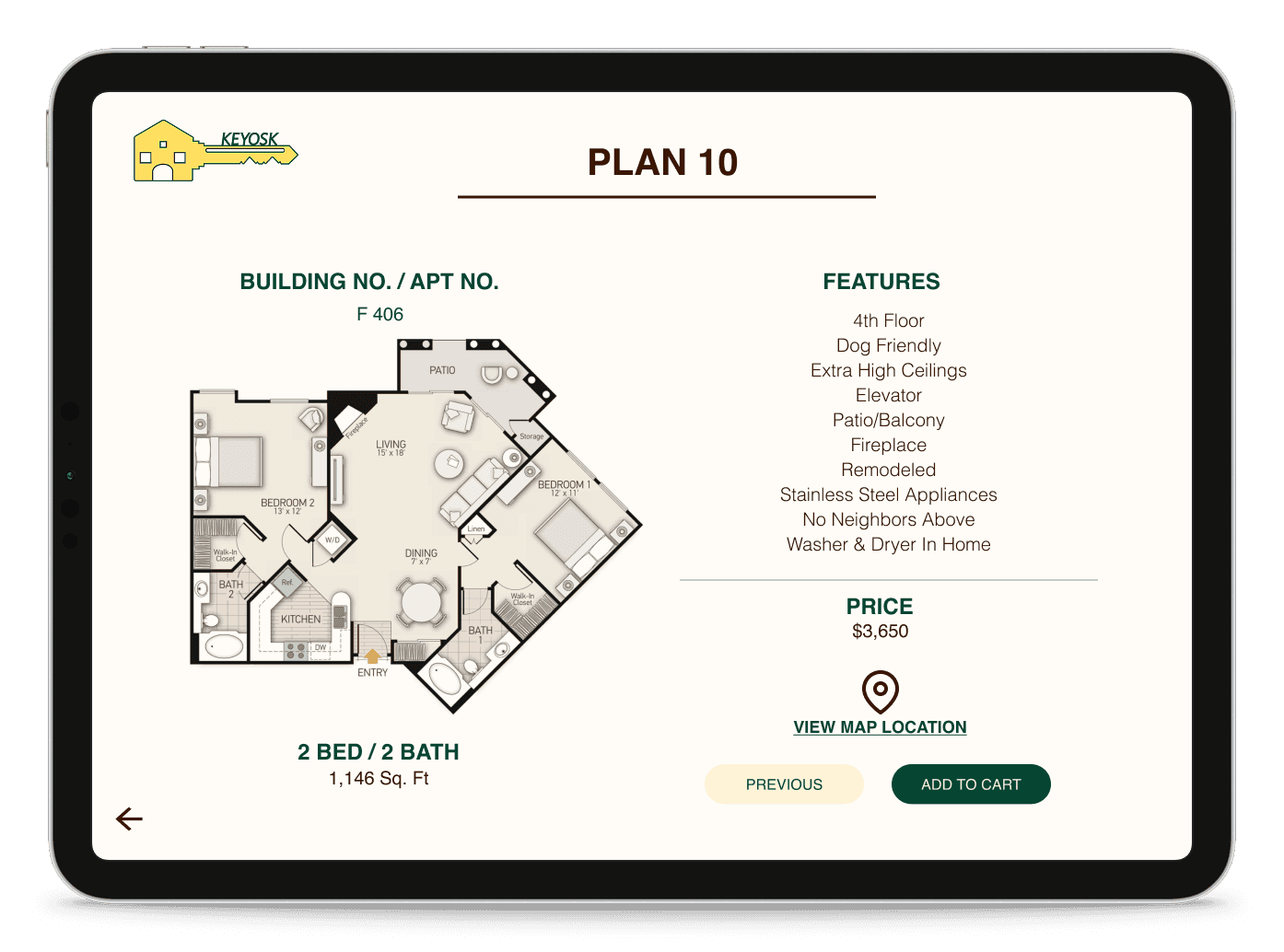
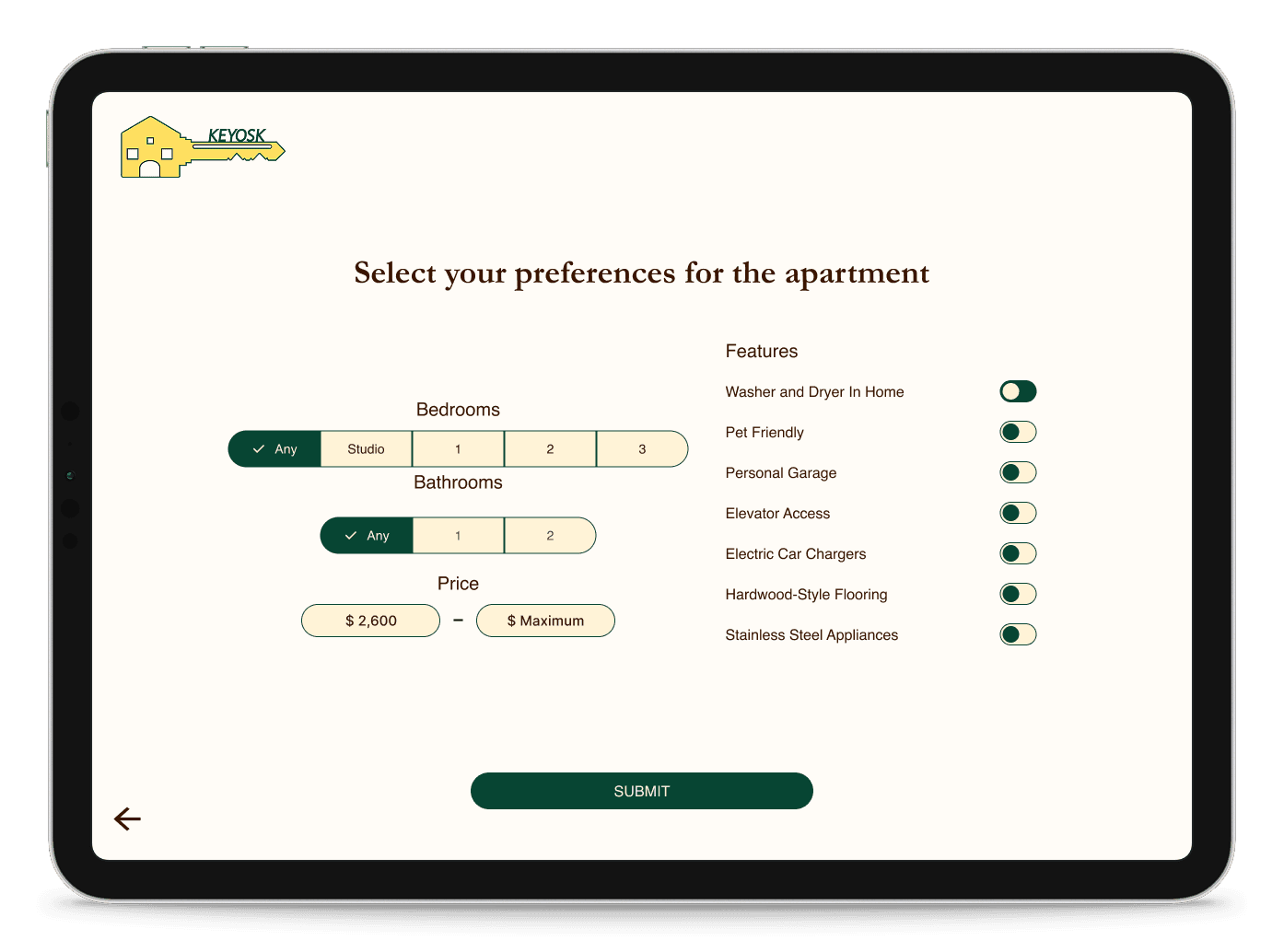
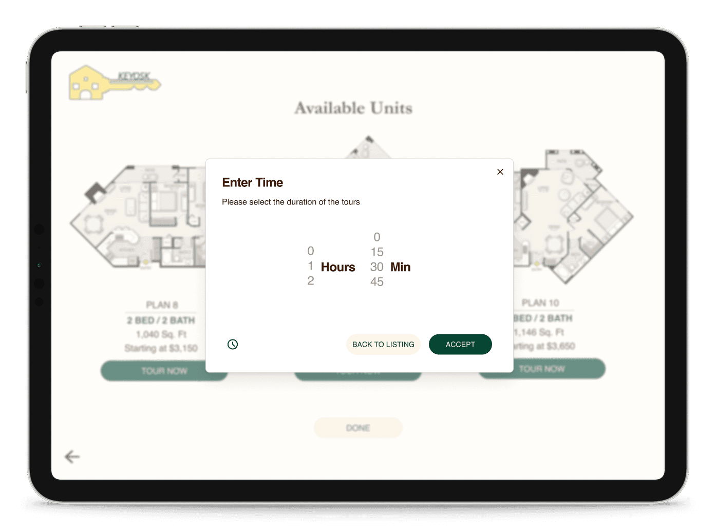
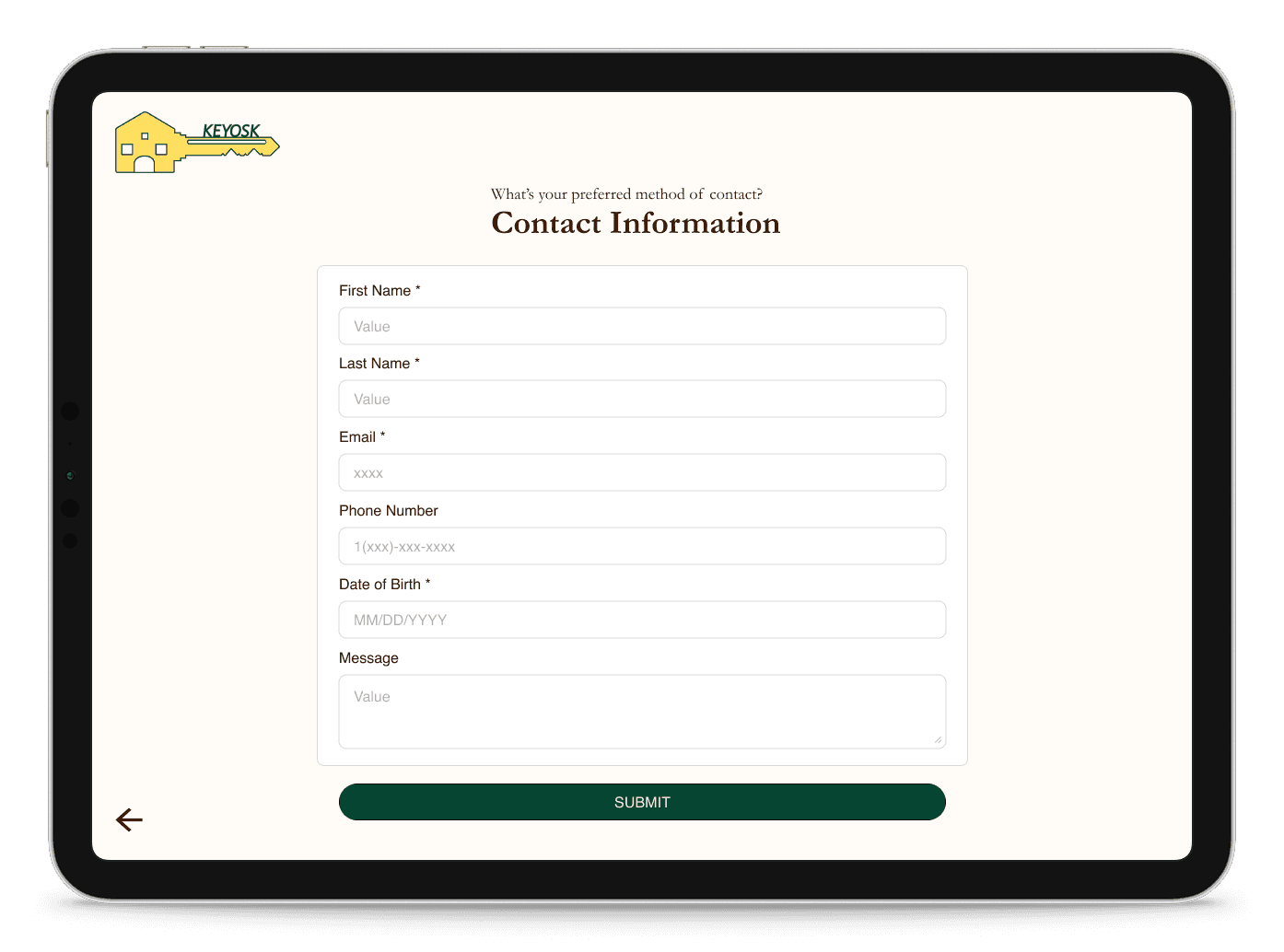
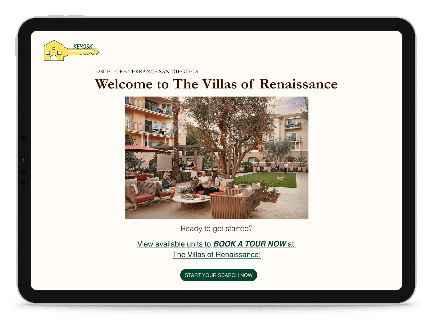
Designed with user needs in mind, the kiosk features intuitive navigation and personalized filters for floor plans, amenities, and pricing. This ensures each user receives a seamless, tailored touring experience that aligns with their individual preferences. The solution addresses common pain points in the rental process, offering convenience, flexibility, and a modern approach to property exploration.
Role
UX/UI Designer
Members
Victoria Tran, Evelyn Lou, Morris Chang
Duration
3 months
Tools used
Design Process
Discover
Online Research
User Interviews
Competitive Analysis
Define
User Personas
User Storyboards
Ideate
Mood boards
Information Architecture
Design
Wireframes
High-Fi Designs
Prototype
UCD Process
Research and Analysis
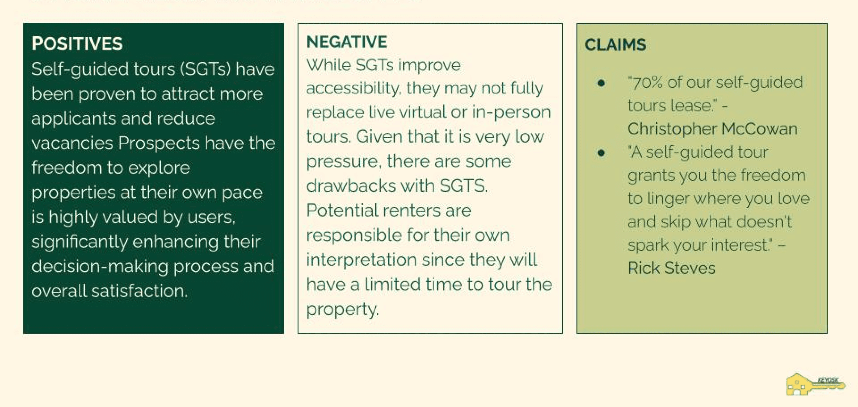
The initial phase of the project centered around user research to better understand renter behavior, usability challenges, and expectations around apartment touring experiences. Through interviews and secondary research, we discovered a growing preference for self-guided tours (SGTs), which allow users to explore spaces independently and assess properties more transparently. Our insights revealed a clear user desire for flexibility, but also a need for better guidance and reassurance throughout the tour experience.
Online Research
UCD Process
User Personas and Interviews
Based on the research findings, user personas are developed to represent potential user with their leasing preferences and challenges. These personas help us empathize with the users and design solutions that align with their specific needs as well as their personality and interest. User interviews were conducted to help identify pain points and opportunities for improvement throughout the self-guided tour journey.
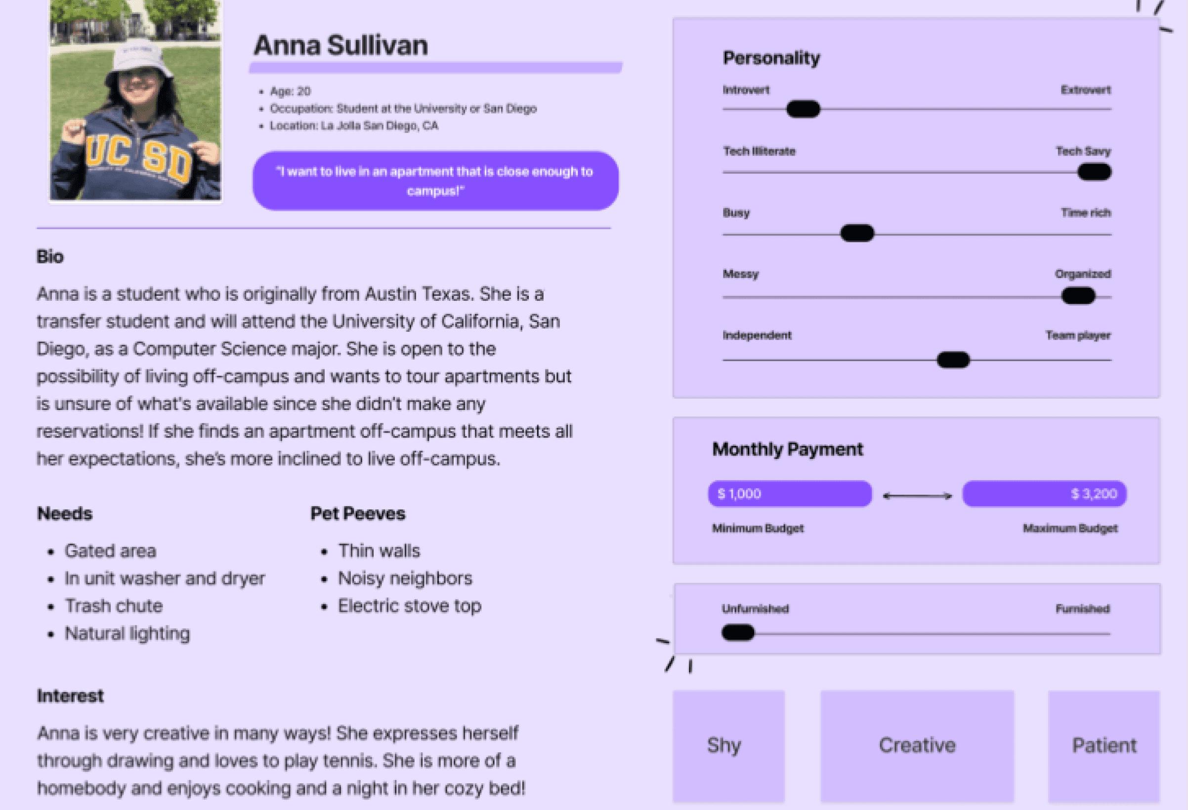
User Personas
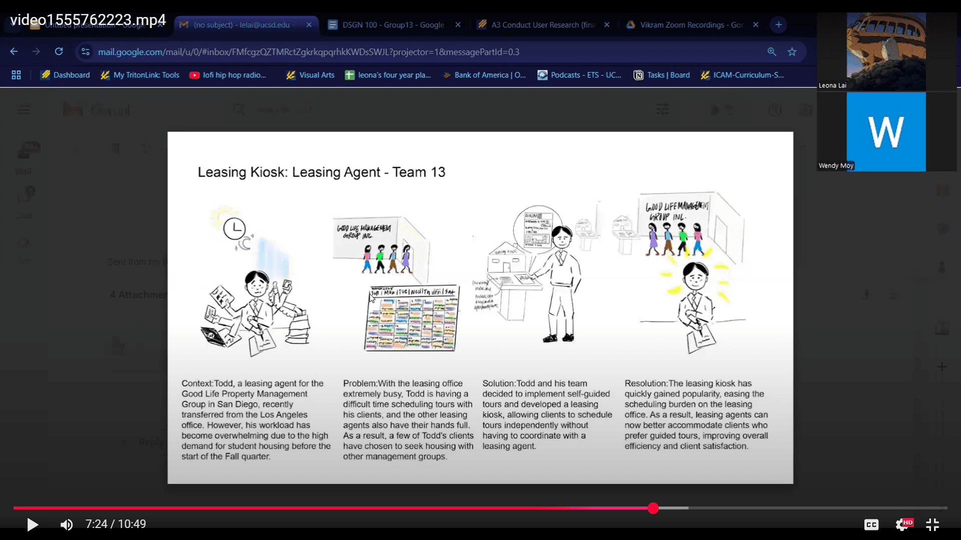
User Interviews
UCD Process
Ideation and Concept Development
For Keyosk, we applied a user-centered design process to create a sleek, self-guided leasing experience that blends convenience with modern living. Inspired by the fusion of "kiosk" and "key," our team used design thinking to develop features like personalized filters and intuitive navigation, tailored to a wide range of renters. Using online research, the design team creates an information architecture that outlines the structure and organization of the app.

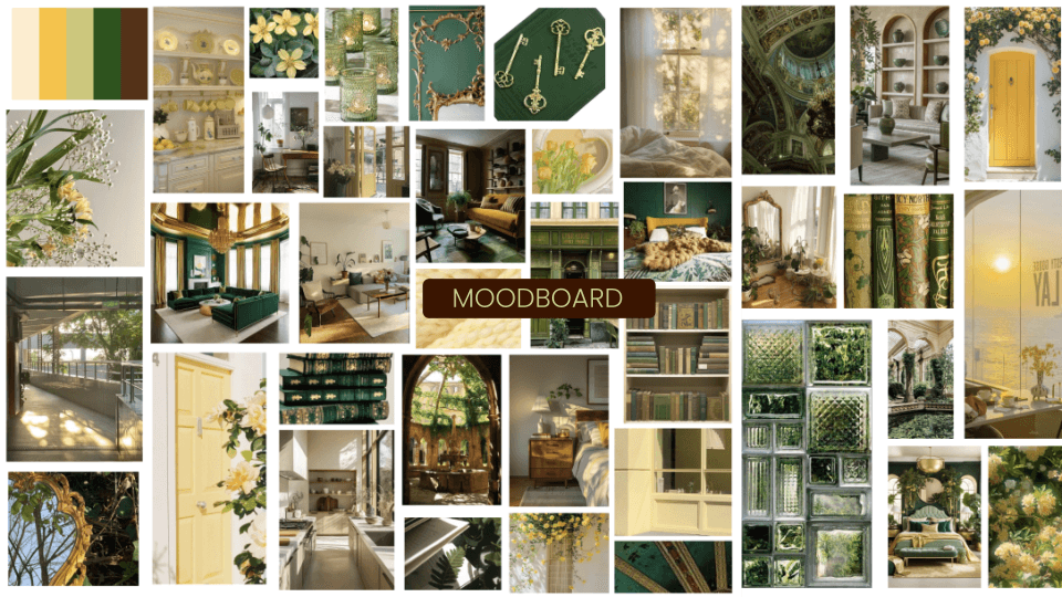
Moodboard
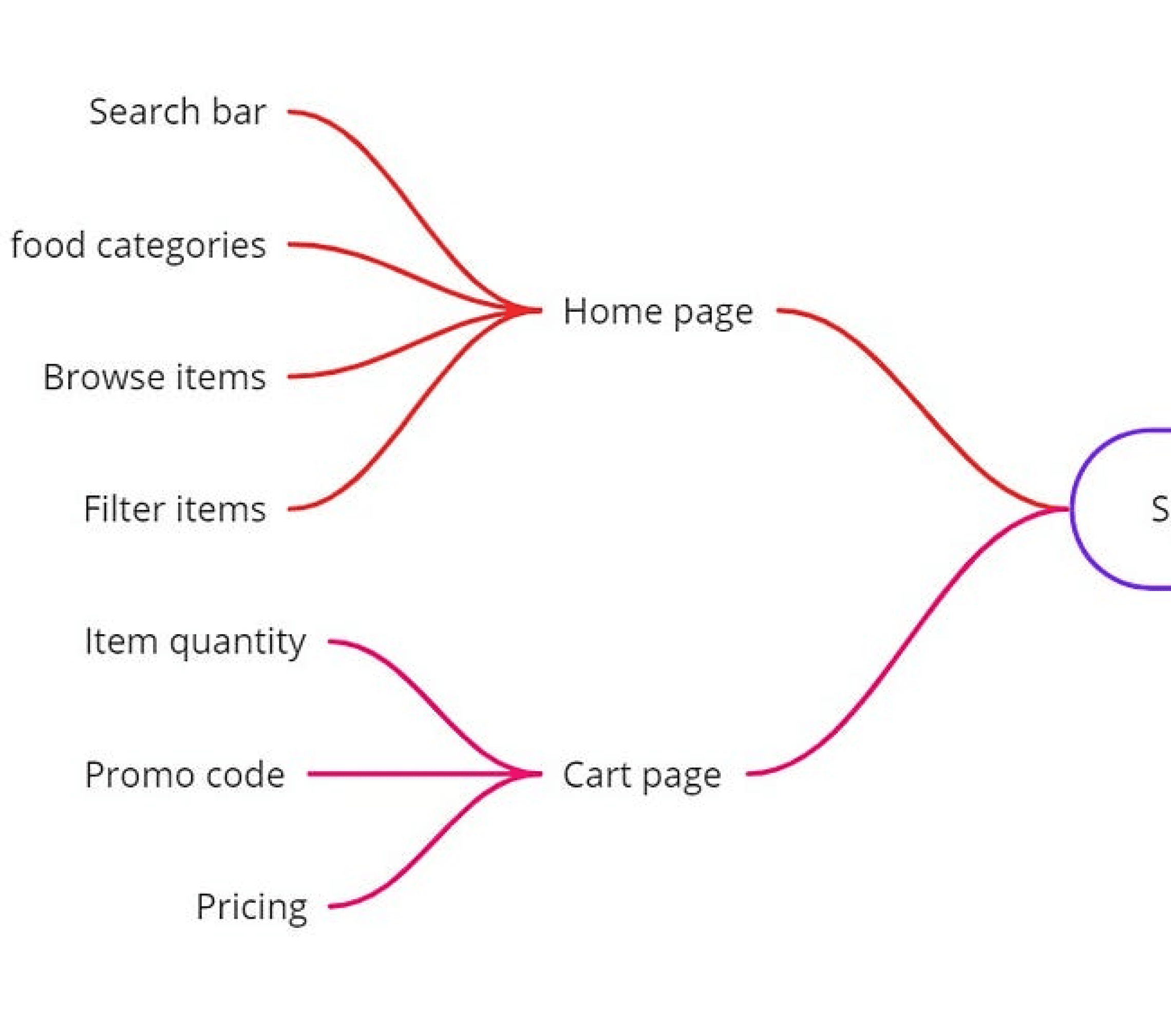
Information Architecture
UCD Process
Low-Fidelity Wireframing
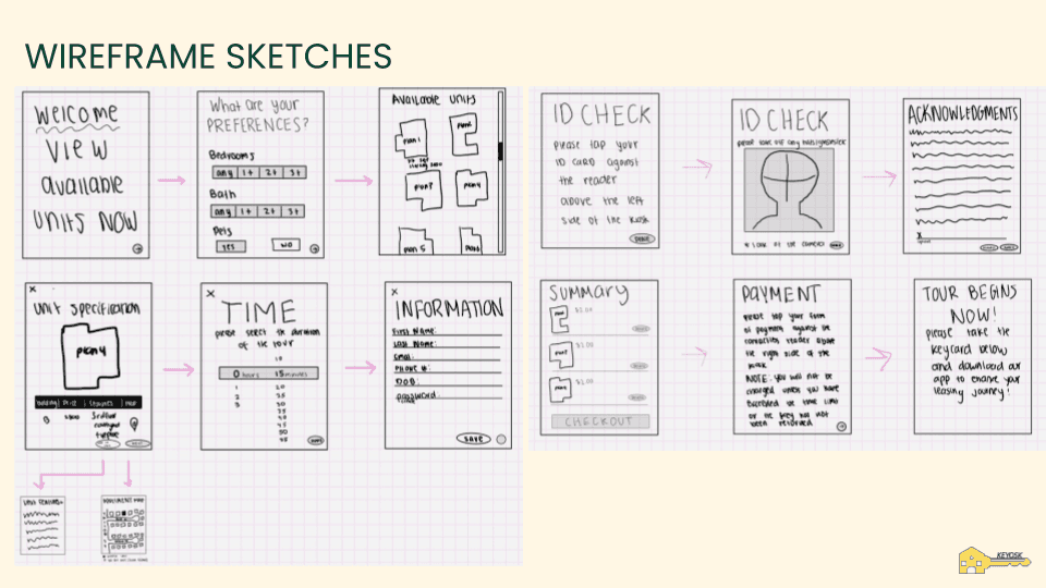
Using the insights gained from research and ideation, the team develops low-fidelity wireframes that depict the app's navigation, content organization, and user flow. The wireframes serve as a blueprint for the app's layout and functionality, ensuring a logical hierarchy and intuitive user interface.
Wireframing
UCD Process
Iterative Prototyping and User Testing
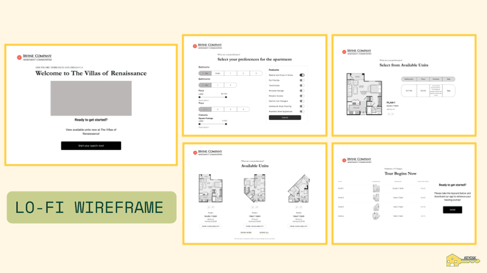
Low-fidelity and high-fidelity prototypes are developed using design tools like Figma. The prototypes showcase the app's visual design, interactions, and transitions. User testing sessions are conducted, allowing participants to navigate through the prototype and provide feedback on usability, clarity, and the overall user experience. Iterations and refinements are made based on the feedback received to improve the design, eliminate pain points, and enhance user satisfaction.
UCD Process
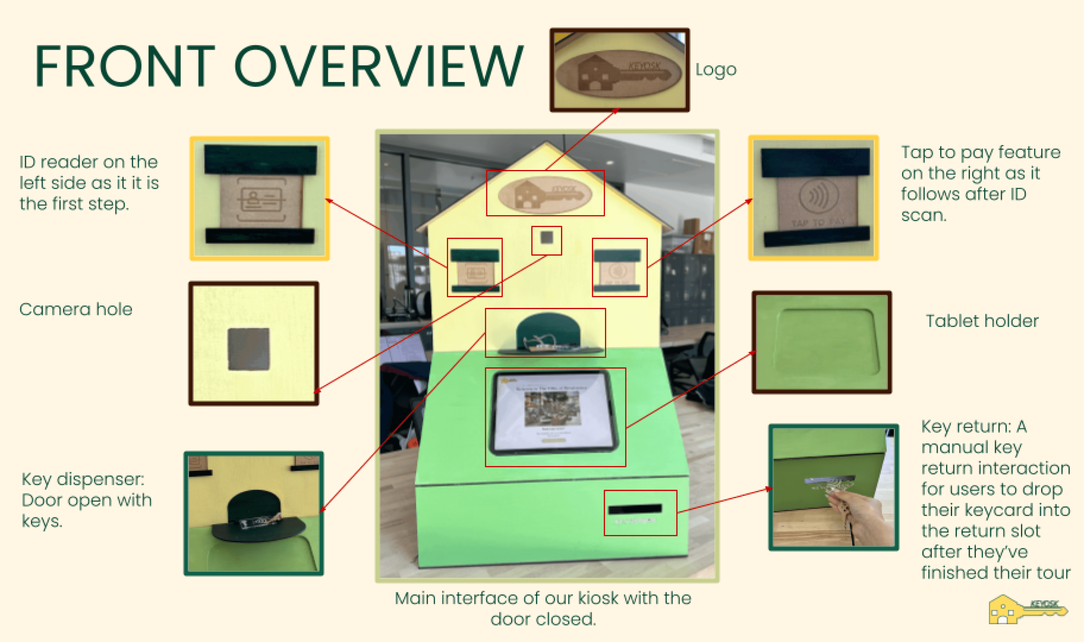
Physical Prototype
Taking into consideration Keyosk’s target audience and brand attributes, the visual design phase focused on crafting a modern, inviting identity that reflects both luxury and accessibility. The design team developed a cohesive visual language—featuring clean typography, a minimalist layout, and a warm, neutral color palette—that speaks to young professionals, families, and urban dwellers alike. Special care was taken to ensure consistency across all kiosk interfaces and digital touchpoints. A comprehensive style guide was created to maintain visual coherence and reinforce Keyosk’s sleek, community-driven brand across future design implementations.
Physical Kiosk
UCD Process
Visual Design
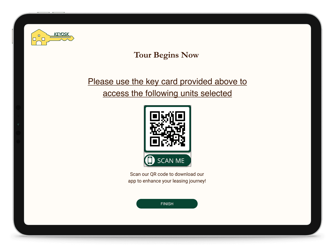
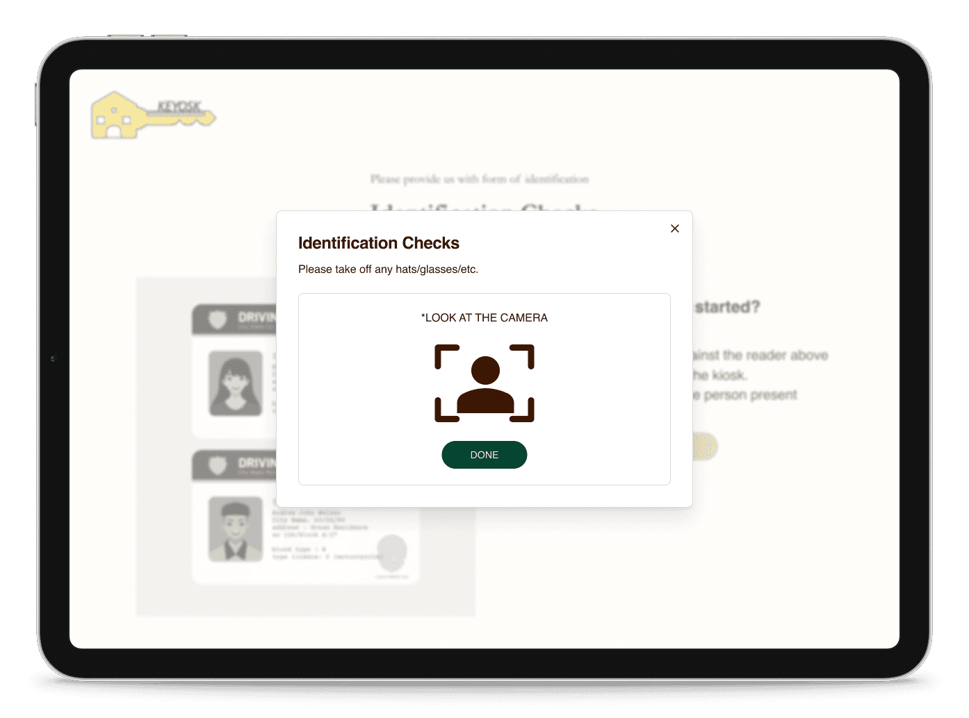
Taking into consideration Keyosk’s target audience and brand attributes, the visual design phase focused on crafting a modern, inviting identity that reflects both luxury and accessibility. The design team developed a cohesive visual language—featuring clean typography, a minimalist layout, and a warm, neutral color palette—that speaks to young professionals, families, and urban dwellers alike. Special care was taken to ensure consistency across all kiosk interfaces and digital touchpoints. A comprehensive style guide was created to maintain visual coherence and reinforce Keyosk’s sleek, community-driven brand across future design implementations.
High-Fidelity
Conclusion
The Keyosk self-guided leasing kiosk, developed through a thoughtful user-centered design process, offers a flexible and intuitive touring experience tailored to modern renters. Through in-depth research, ideation, prototyping, and user testing, Keyosk was built to meet diverse user needs while reflecting a sleek, community-driven brand. The result is a tech-forward solution that enhances accessibility, streamlines the leasing process, and elevates the overall touring experience.
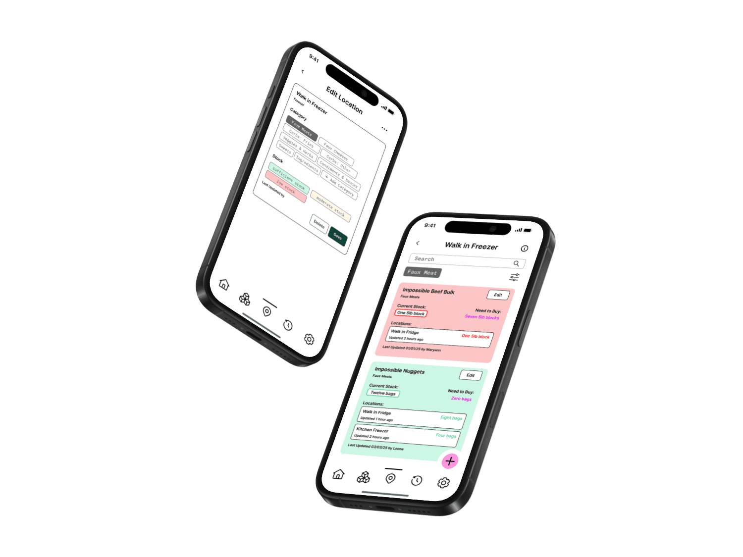
Food Inventory App
PrepTrack
UX Design | UI Design | Mobile App Design
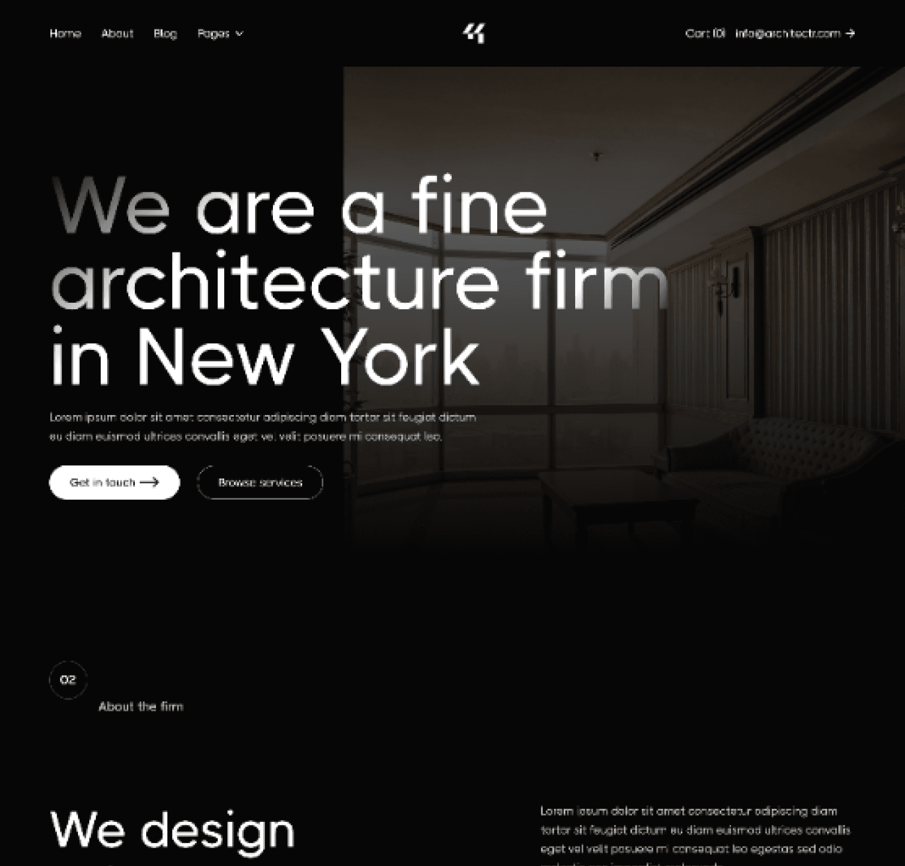
Website Redesign
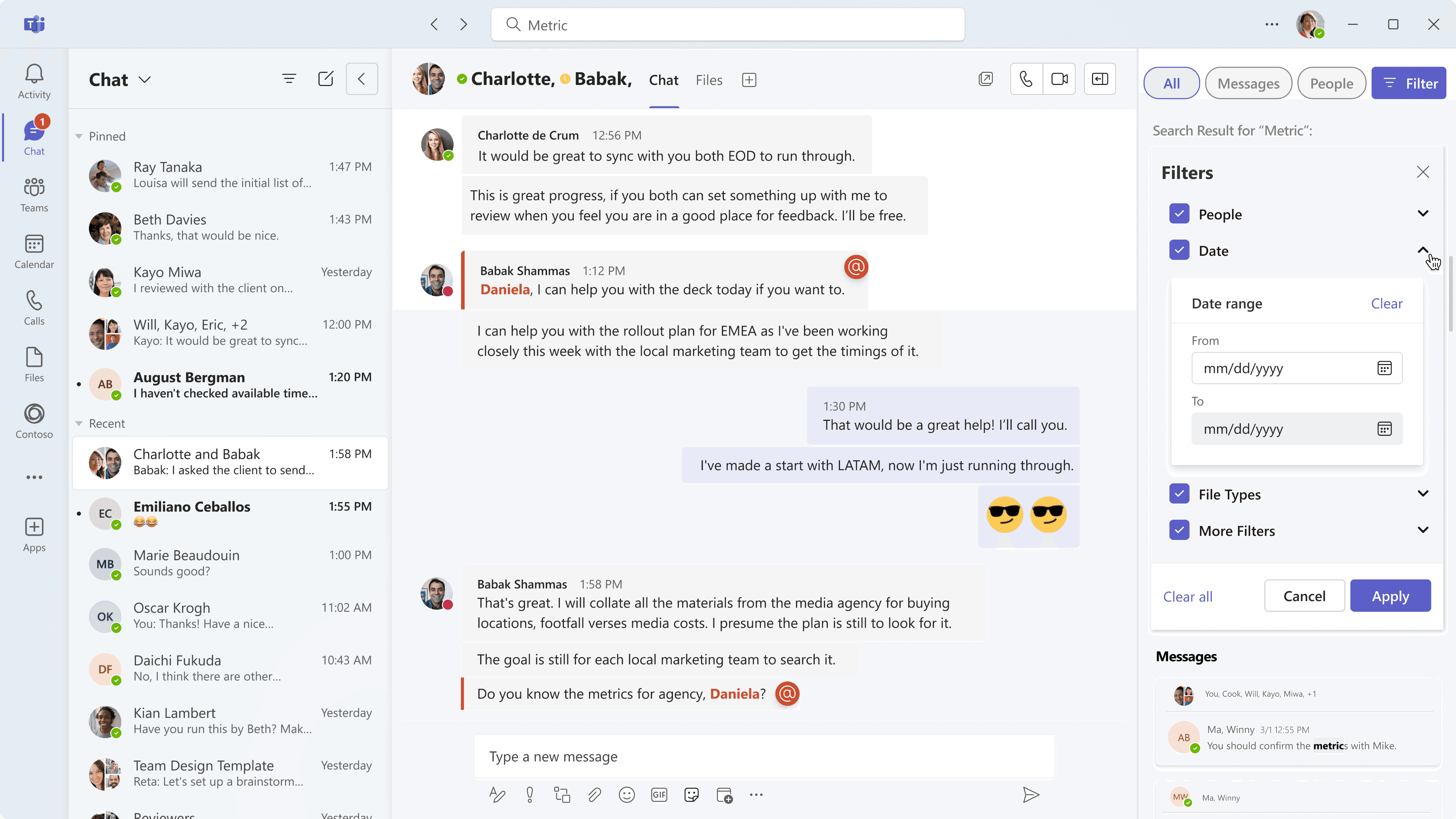
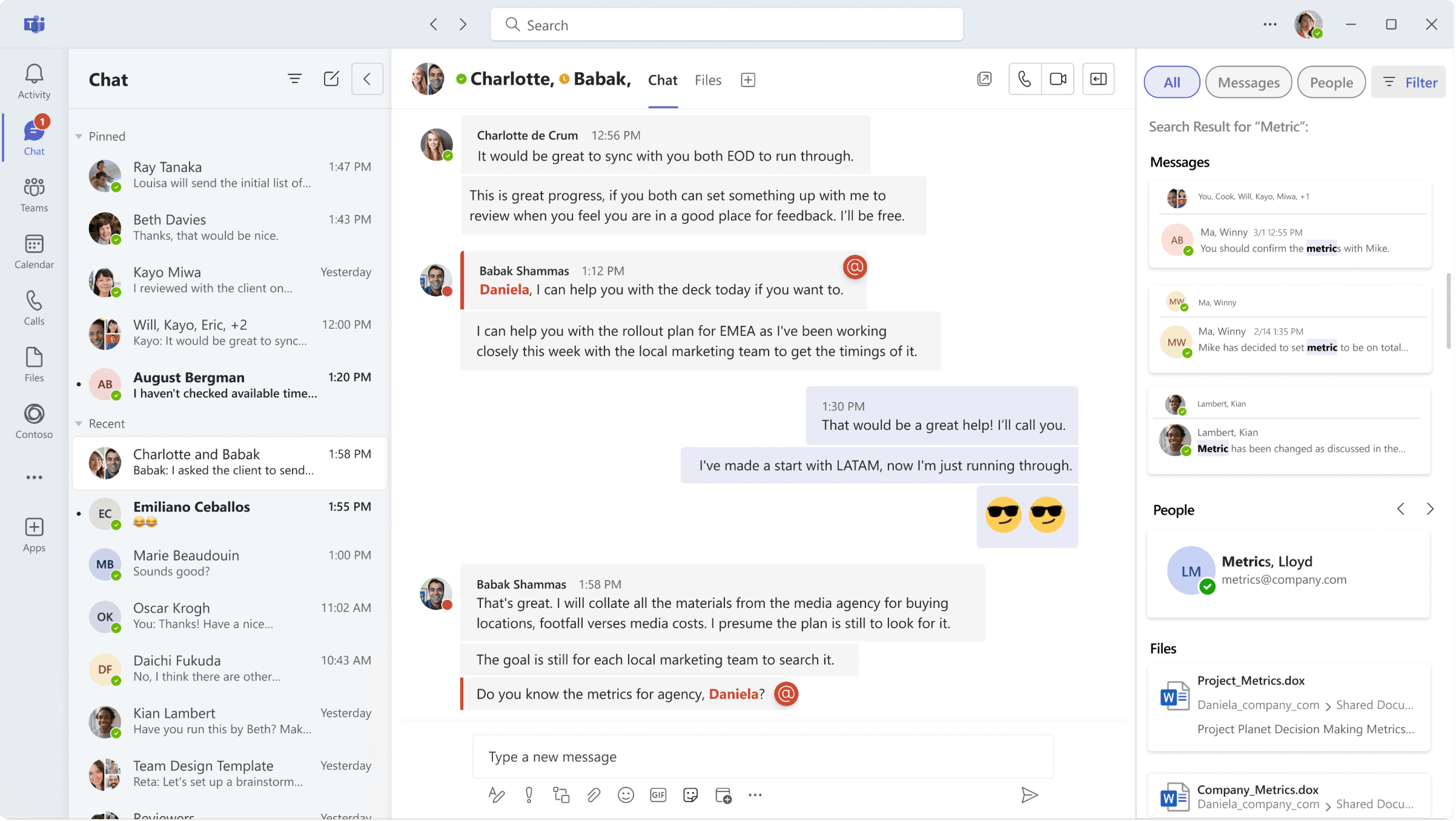
Mircosoft Teams
UX Design | UI Design | Desktop App Redesign


© 2024 By Leona Lai.
Privacy policy
Cookies policy